Room Layout Mistakes That Make Spaces Feel Smaller
You walk into your living room and immediately feel cramped, even though the square footage seems adequate on paper.
The culprit might not be the size of your space—it could be how you’ve arranged it. Small layout mistakes can make even generous rooms feel claustrophobic and unwelcoming.
Pushing All Your Furniture Against the Walls
You might think that shoving every piece of furniture against the perimeter creates more floor space, but this approach actually backfires.
When you line up your sofa, chairs, and tables around the edges, you create a bowling alley effect that makes the room feel narrow and disconnected.
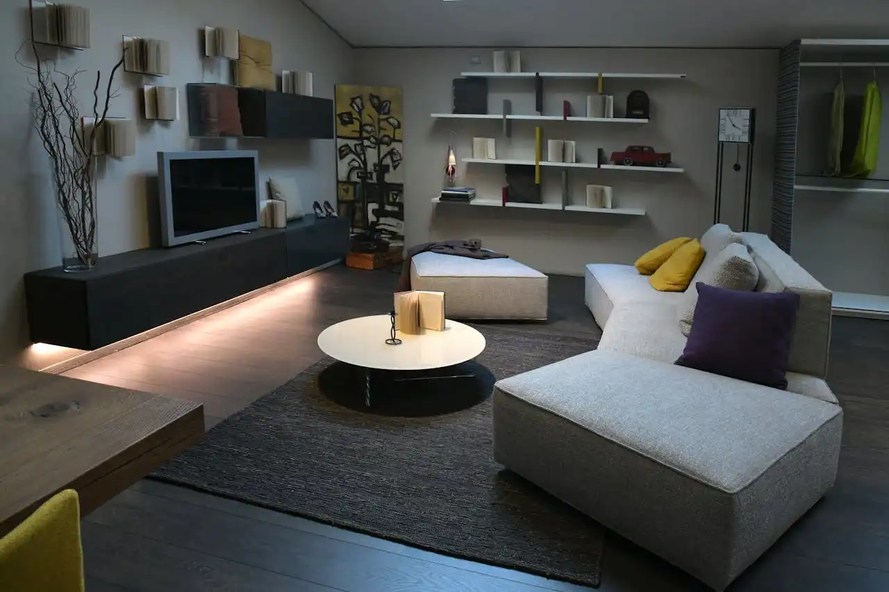
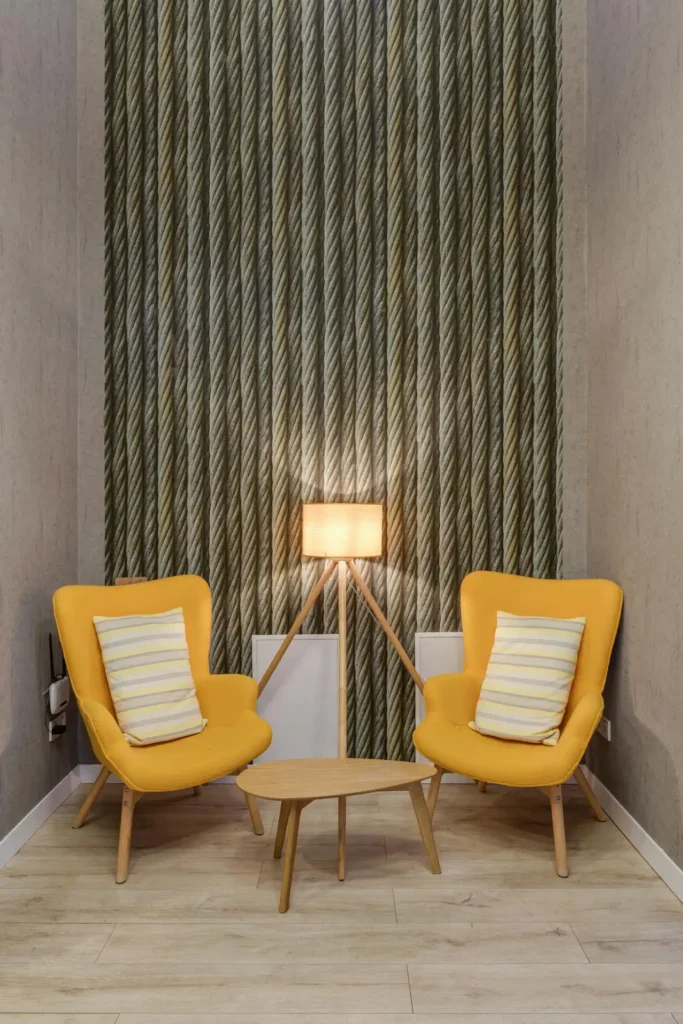
Instead of hugging the walls, try floating your furniture in the space. This technique tricks the eye into perceiving more depth and dimension.
Pull your sofa a few feet away from the wall and angle chairs toward each other to create intimate conversation areas.
You can define a reading nook with a chair and side table, establish a main seating area with your sofa and coffee table, and leave pathways that flow naturally between these spaces.
Remember that negative space—the empty areas between furniture—serves as visual breathing room. The key lies in creating multiple zones within your room.
When you crowd everything to the edges, you eliminate these crucial pauses that help your eye process the layout comfortably.
Choosing Oversized Furniture for Your Space
You fall in love with that massive sectional sofa at the showroom, but bringing it home transforms your living room into a furniture warehouse.
Oversized pieces dominate small spaces and leave little room for movement or additional elements that make a room feel complete.
Scale matters more than you might realize. A bulky entertainment center that takes up an entire wall creates visual weight that presses down on the space.
Similarly, a dining table that barely fits forces you to squeeze between chairs and walls, making every meal feel cramped.
Measure your room carefully before shopping, and don’t forget to account for walking space around each piece.
You need at least 18 inches of clearance around a dining table and 36 inches for main walkways through the room.
Consider furniture with legs instead of pieces that sit directly on the floor.
When you can see underneath chairs, sofas, and tables, your eye perceives more floor space, which creates an illusion of roominess even in compact areas.
Blocking Natural Light Sources
You hang heavy curtains that cover your windows completely, or you place tall furniture directly in front of light sources.
These choices immediately shrink your space by cutting off the natural illumination that makes rooms feel open and airy.
Light expands space visually, so any barrier between your room and its light sources works against you.
That bookshelf positioned right in front of your window might provide storage, but it also creates a dark corner that feels closed off from the rest of the room.
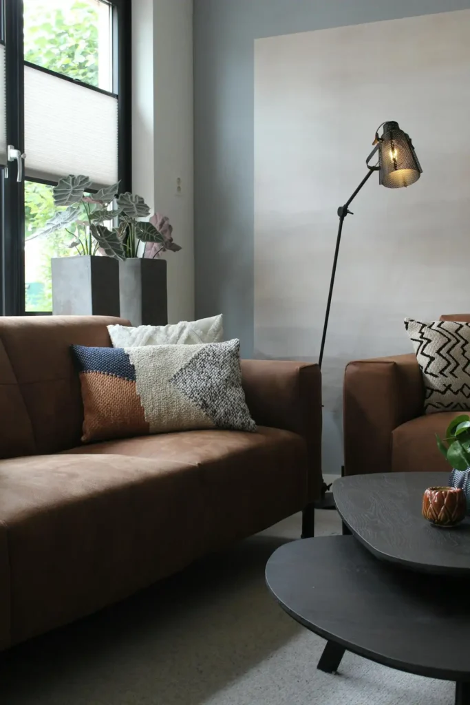
Rethink your window treatments to maximize light flow. Choose sheer curtains or blinds that you can fully open during the day.
If privacy concerns require heavier coverings, install curtain rods that extend beyond the window frame so you can pull panels completely clear of the glass.
Position your furniture to complement your light sources rather than compete with them.
Angle seating toward windows when possible, and use mirrors strategically to bounce light around the room and create the impression of additional windows.
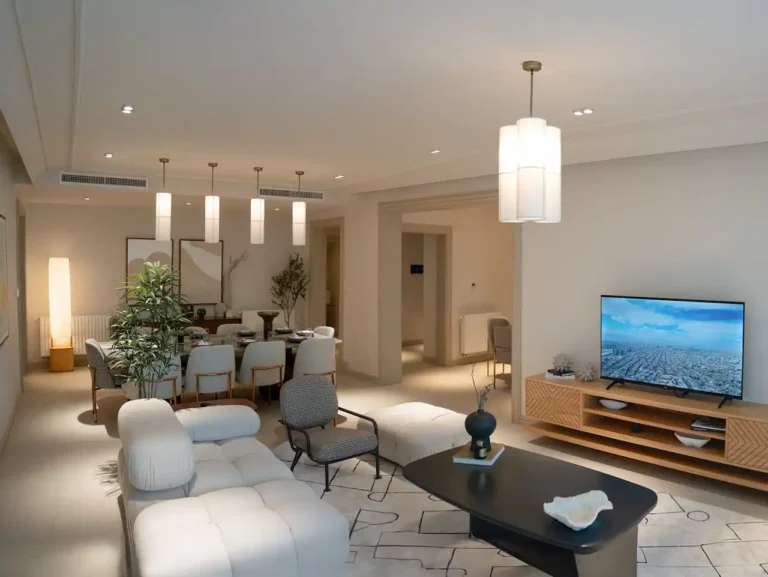
Creating Poor Traffic Flow Patterns
You arrange furniture without considering how people move through the space, creating awkward zigzag paths that make navigation feel like an obstacle course.
When guests have to squeeze between the coffee table and sofa or walk around multiple pieces to reach the other side of the room, your layout feels cramped regardless of actual square footage.
Think about your room’s natural traffic patterns before placing any furniture. Identify the main entry and exit points, then ensure clear, straight pathways connect these areas.
You should be able to walk from your front door to your kitchen without having to sidestep around furniture.
The 36-inch rule applies to all major walkways—you need this much clearance for two people to pass comfortably.
Secondary pathways can be slightly narrower at 24 inches, but anything less feels restrictive and makes your space seem smaller than it actually is.
Consider sight lines as well as walking paths. When you can see from one area of your room to another without visual obstructions, the space feels more open and connected.
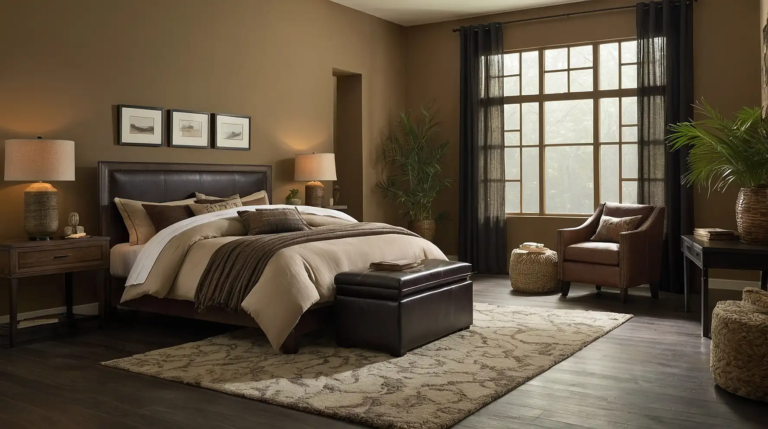
Using the Wrong Rug Size
You choose a tiny area rug that floats in the middle of your seating area like a small island, or you select one so large that it overwhelms the room.
Both mistakes make your space feel awkward and disproportionate. This creates a cohesive look that pulls the arrangement together.
The right rug anchors your furniture grouping and defines the space without calling attention to itself.
In a living room, your rug should be large enough for at least the front legs of all major seating pieces to rest on it.
Alternatively, you can place all furniture legs on the rug if your budget and room size allow. Avoid placing rugs that stop just short of furniture pieces.
This approach works particularly well in smaller spaces because it creates one unified zone rather than multiple competing elements.
When your rug ends inches away from your sofa or chairs, it creates visual disconnection that chops up the floor space and makes the room feel fragmented.
Overcrowding with Too Many Small Accessories
You fill every surface with decorative objects, thinking that more personality equals better design.
However, visual clutter creates mental fatigue and makes your space feel chaotic and cramped, even when you have adequate physical room.
Your eye needs places to rest, just like your body needs comfortable seating. Group items in odd numbers and vary heights to create visual interest without chaos.
When every tabletop, shelf, and surface holds multiple items, your brain works overtime to process all the visual information, creating a sense of overwhelm that translates to feeling spatially confined.
Practice the “less is more” principle by editing your accessories ruthlessly. Leave some surfaces completely clear to provide visual breathing room.
Choose a few meaningful pieces that you truly love rather than displaying everything you own.
Empty space on a side table or bookshelf gives your eye a place to pause and makes the entire room feel more serene and spacious.
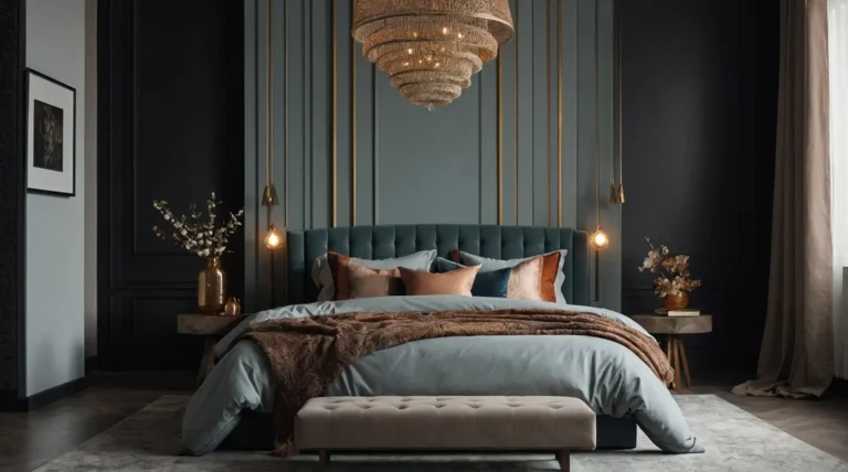
Hanging Artwork and Fixtures Too Low
You mount your artwork at eye level when you’re sitting down, or you choose pendant lights that hang too low over your dining table.
These low-hanging elements create visual barriers that compress the perceived height of your room and make it feel smaller.
Height draws the eye upward and creates the illusion of more space. Use vertical arrangements to emphasize height.
When you hang pictures, mirrors, and light fixtures too low, you effectively lower the visual ceiling and make your room feel squashed.
Hang artwork 57 to 60 inches from the floor to the center of the piece—this works for most ceiling heights and viewing positions.
For pendant lights over dining tables, maintain 30 to 36 inches of clearance between the bottom of the fixture and the table surface.
A tall, narrow mirror or a series of pictures arranged in a vertical column draws attention upward and makes your ceiling feel higher than it actually is.
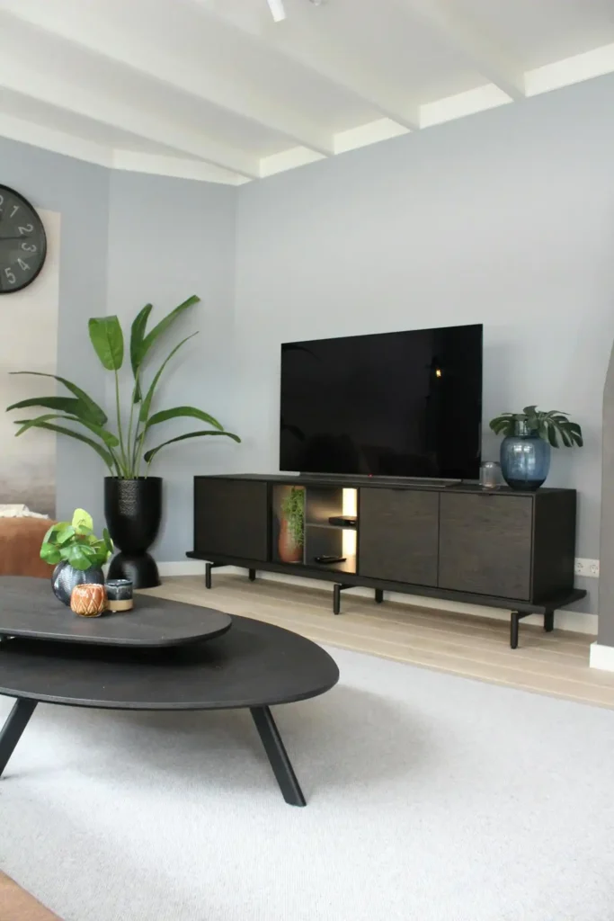
Ignoring Vertical Storage Opportunities
You focus all your storage solutions at floor level, missing chances to use wall space that could keep clutter off surfaces while drawing attention upward.
Low, horizontal storage pieces make rooms feel wider but also shorter and more compressed.
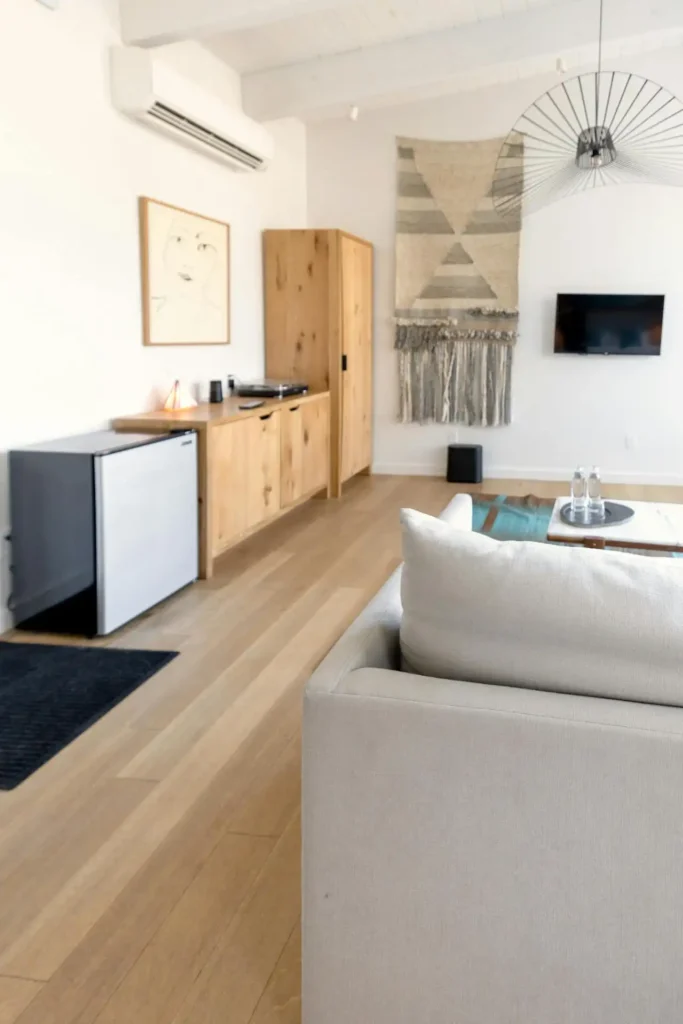
Think vertically when planning storage and display areas. Consider built-in solutions that extend from floor to ceiling.
Tall bookcases, wall-mounted shelving, and floor-to-ceiling cabinets maximize your storage capacity without consuming valuable floor space.
These vertical elements also create the illusion of height that makes rooms feel more spacious.
Install floating shelves near the ceiling to store items you don’t use daily. This approach keeps essentials accessible while maintaining clean lines at eye level.
You can also use the space above doorways and windows for decorative storage that adds personality without cluttering main living areas.
These custom pieces provide maximum storage while creating clean, uninterrupted lines that make walls appear taller and rooms feel more expansive.
Using Dark Colors Everywhere
You paint your walls, ceiling, and trim in dark colors, thinking it creates a cozy atmosphere.
While dark colors can add sophistication, using them extensively in small spaces absorbs light and makes boundaries feel closer than they actually are.
Light colors reflect natural and artificial light, making spaces feel brighter and more open. Paint your ceiling a shade lighter than your walls to create the illusion of height.
You don’t have to stick with stark white—soft blues, warm grays, and creamy neutrals all work to expand space visually while maintaining personality and warmth.
Consider using darker colors strategically as accent elements rather than dominant themes.
A dark accent wall can add depth and interest without overwhelming the space, especially when you balance it with lighter colors on the remaining walls.
This simple trick makes the ceiling feel farther away and gives your room a more expansive feeling overall.
Neglecting Multi-Functional Furniture
You choose single-purpose pieces that take up valuable real estate without earning their keep.
In smaller spaces, every piece of furniture should work harder by serving multiple functions while maintaining a clean, uncluttered appearance.
Ottoman storage cubes provide seating, surface space, and hidden storage all in one compact footprint.
Console tables with shelving underneath offer display space above and practical storage below.
Extendable dining tables accommodate dinner parties when needed but don’t dominate the room daily.
Look for pieces with built-in storage opportunities. Choose furniture that can adapt to different uses throughout the day.
Beds with drawers underneath, coffee tables with hidden compartments, and benches with lift-up seats all help you maintain organization without adding extra furniture pieces that crowd your floor plan.
A dining table might serve as a workspace during the day, and a storage ottoman can provide extra seating when guests arrive while hiding throws and pillows when not needed.
Conclusion
Small changes in furniture placement and design choices create dramatic improvements in how spacious your rooms feel.
Apply these principles thoughtfully to transform cramped spaces into comfortable, welcoming areas that feel larger than their actual dimensions.