Color Psychology in Home Décor: What Your Walls Are Saying
Your walls speak volumes about your personality, but they also influence your mood, energy levels, and daily behavior in ways you might not realize.
Understanding color psychology helps you create spaces that support your lifestyle and emotional well-being.
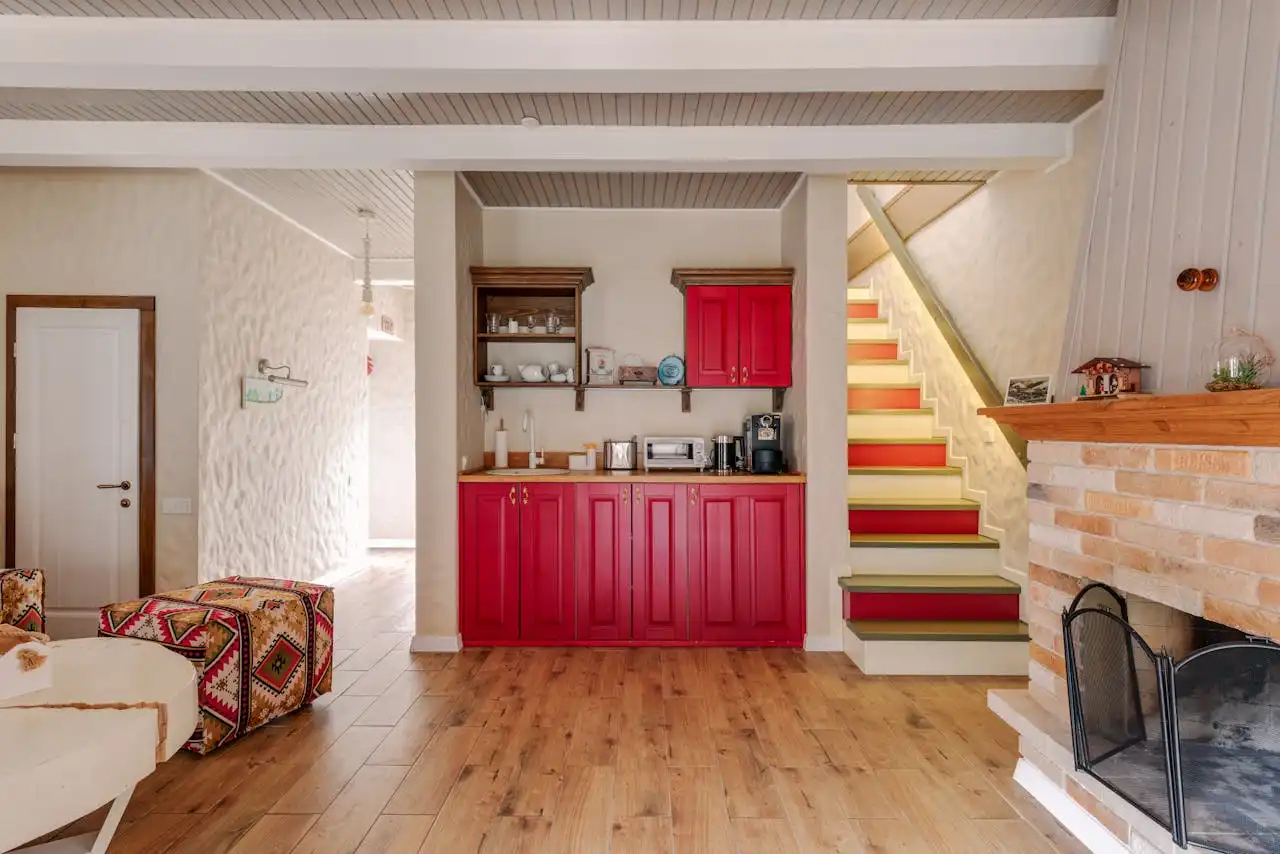
Red: The Energizer That Commands Attention
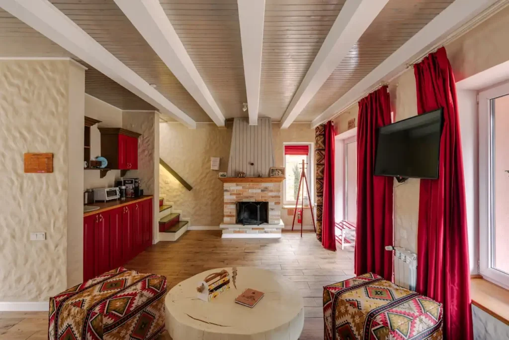
You walk into a red room and immediately feel your heart rate increase. Red stimulates the nervous system, raising blood pressure and creating a sense of urgency and excitement.
This powerful color demands attention and can make you feel more alert and energetic, which explains why it’s often used in restaurants to encourage quick dining and higher turnover.
In your home, red works beautifully as an accent color in social spaces like dining rooms or living areas where you want to encourage conversation and activity.
You can use deep burgundy or wine shades for a more sophisticated approach, or bright crimson for maximum impact.
These warmer tones create intimacy and make large spaces feel more cozy and inviting.
However, you should avoid painting entire bedrooms red, as this color can interfere with sleep and relaxation.
The stimulating effects that make red perfect for entertaining areas can become overwhelming in spaces meant for rest.
Instead, consider using red in small doses through artwork, throw pillows, or a single accent wall.
If you love red but worry about overwhelming your space, try incorporating it through textiles and accessories first.
Red curtains, rugs, or decorative objects allow you to experiment with this energizing color without committing to a full wall transformation that might feel too intense over time.
Blue: The Calming Force for Mind and Body
You’ve probably noticed how staring at a clear blue sky instantly relaxes your mind. Powder blue or sky blue creates an airy, spacious feeling that makes small rooms appear larger.
Blue has the opposite effect of red, actually lowering blood pressure and heart rate while promoting feelings of calm and tranquility.
This color connects us to nature through associations with sky and water, creating an inherently peaceful atmosphere in any space.
Light blue shades work particularly well in bedrooms, bathrooms, and home offices where you need to focus or unwind.
These lighter tones promote better sleep quality and can help reduce stress levels after long, demanding days.
Darker blue shades like navy or midnight blue add sophistication and depth to your décor while maintaining those calming properties.
You can use these deeper tones in studies, libraries, or formal living spaces where you want to create a sense of stability and trustworthiness.
Navy blue serves as an excellent neutral alternative to black or brown. The versatility of blue makes it an ideal choice for nearly any room in your home.
You can pair it with white for a fresh, coastal feel, combine it with gray for modern sophistication, or accent it with warm colors like coral or yellow to prevent the space from feeling too cool or sterile.
Green: Nature’s Perfect Balance
You instinctively feel at peace in green spaces because this color represents growth, renewal, and the natural world.
Green sits perfectly balanced between warm and cool tones on the color spectrum, making it one of the most restful colors for human eyes.
This natural harmony explains why spending time in green environments reduces eye strain and promotes overall well-being.
Sage green and olive tones bring sophistication to living rooms and bedrooms while maintaining that connection to nature.
These muted greens work beautifully with natural materials like wood and stone, creating spaces that feel grounded and organic.
You can use these colors to create a spa-like atmosphere in bathrooms or a serene retreat in bedrooms.
Brighter greens like emerald or forest green add vibrancy without the overwhelming intensity of red or orange.
These saturated greens work wonderfully in kitchens and dining areas, where they can stimulate appetite while maintaining a fresh, clean feeling.
The color’s association with health and vitality makes it perfect for spaces where you prepare and enjoy food.
You can incorporate green through plants as well as paint, creating living color that actually improves air quality while providing psychological benefits.
This dual approach allows you to enjoy green’s calming effects while adding natural texture and movement to your space through foliage and flowers.
Yellow: The Mood Booster That Energizes Your Day
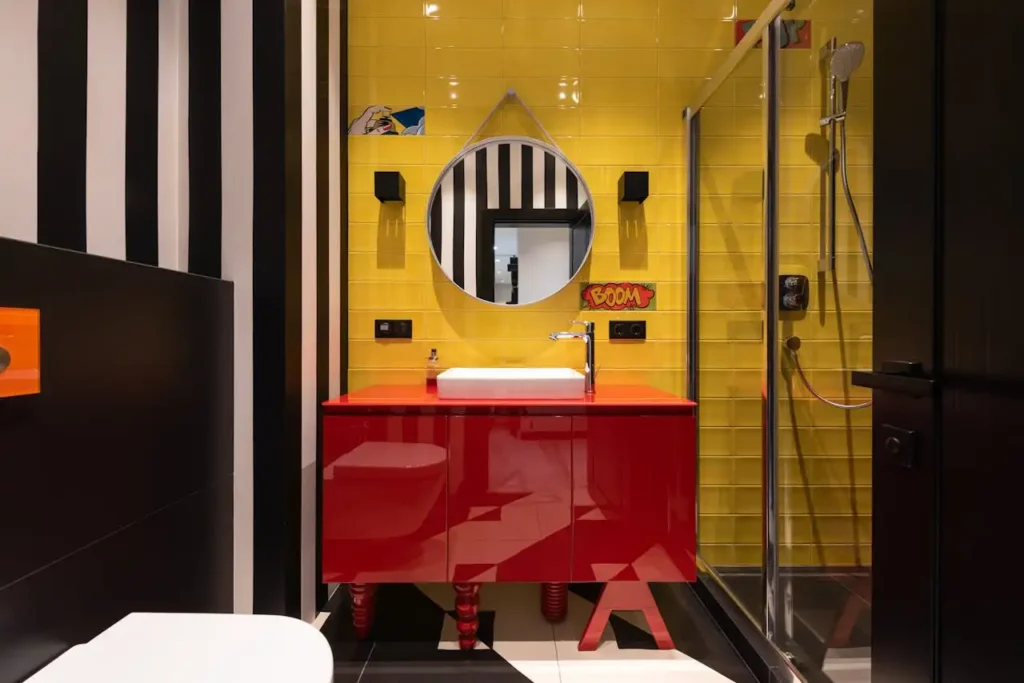
You feel happier almost instantly when surrounded by yellow because this color stimulates the production of serotonin, your brain’s natural mood-boosting chemical.
Yellow captures the warmth and energy of sunlight, making it perfect for kitchens, breakfast nooks, and other spaces where you start your day.
This cheerful color can actually help combat seasonal depression and create optimism. These gentle yellows create a welcoming atmosphere that feels both cozy and uplifting.
Soft butter yellow or cream tones work well in bedrooms and living spaces, providing warmth without overwhelming stimulation.
You can use these shades to brighten north-facing rooms that don’t receive much natural light throughout the day.
Brighter yellows work best as accent colors rather than dominant wall colors, as too much intense yellow can become agitating and cause anxiety.
You might choose sunny yellow for a powder room or use it in artwork and accessories throughout your home.
This approach gives you yellow’s mood-boosting benefits without risking visual overload.
When working with yellow, consider the undertones carefully. Golden yellows feel warm and rich, while lemon yellows appear cool and energetic.
Choose undertones that complement your existing décor and the atmosphere you want to create in each specific room.
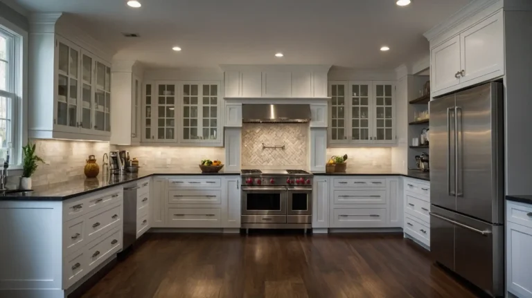
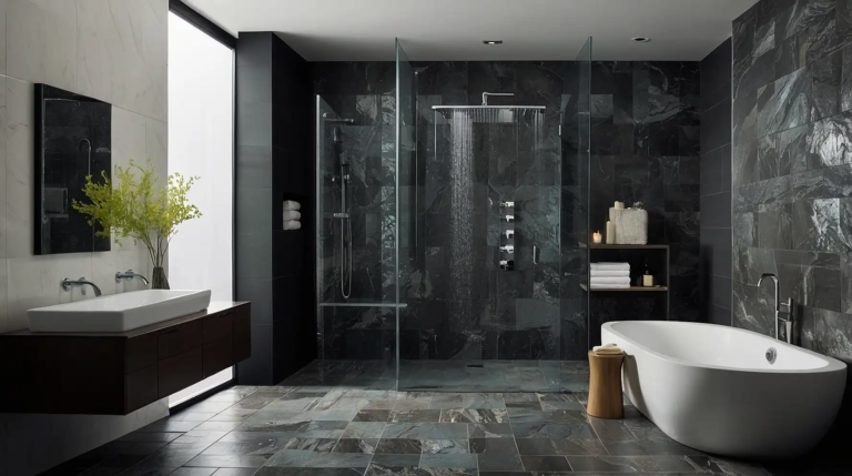
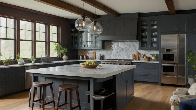
Neutral Colors: The Foundation of Emotional Balance
You rely on neutral colors to create calm, timeless spaces that don’t compete with your furnishings or artwork.
Whites, grays, beiges, and taupe’s serve as the perfect backdrop for your life while providing psychological stability and peace.
These colors allow other elements in your room to shine while creating a sense of spaciousness and cleanliness.
White walls reflect light beautifully, making spaces appear larger and brighter while promoting feelings of clarity and fresh starts.
Pure white can feel stark in some settings, so you might choose warm whites with cream or yellow undertones for a softer, more inviting atmosphere.
These warmer whites work particularly well in bedrooms and living areas. Gray’s neutral nature makes it incredibly versatile for any room.
Gray has become incredibly popular because it offers sophistication without the starkness of white or the heaviness of darker colors.
Light grays provide a modern, clean backdrop that works with any decorating style, while charcoal grays add drama and elegance to dining rooms and studies.
Beige and taupe connect you to earth tones while maintaining that neutral flexibility.
These colors create warmth and comfort without overwhelming your senses, making them perfect for creating cozy, inviting spaces where people naturally want to gather and relax.
Purple: The Creative Catalyst for Inspiration
You tap into your creative side more easily in purple environments because this color stimulates imagination and artistic thinking.
Purple combines red’s energy with blue’s calming properties, creating a unique color that promotes both creativity and contemplation.
This makes purple perfect for art studios, craft rooms, or any space where you engage in creative activities.
Lavender and lilac create dreamy, romantic atmospheres that work beautifully in bedrooms and bathrooms.
These soft purple tones promote relaxation while maintaining a sense of luxury and femininity.
You can use these lighter purples to create spa-like retreats that feel both calming and indulgent.
Deeper purples like eggplant or royal purple add richness and drama to formal spaces.
These sophisticated shades work well in dining rooms, libraries, or master bedrooms where you want to create an atmosphere of luxury and exclusivity.
Rich purples pair beautifully with gold accents and crystal lighting for maximum elegance.
You should use purple thoughtfully, as too much can feel overwhelming or melancholy.
Consider using purple as an accent wall or through textiles and accessories rather than painting entire rooms in this intense color.
This approach allows you to enjoy purple’s creative benefits without risking emotional overload.
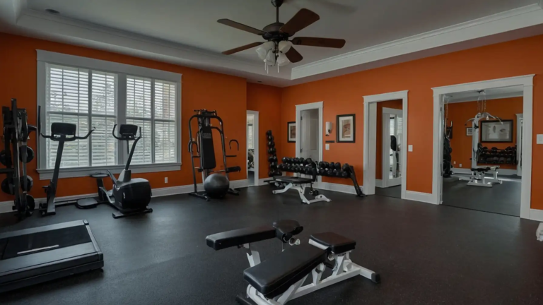
Orange: The Social Color That Brings People Together
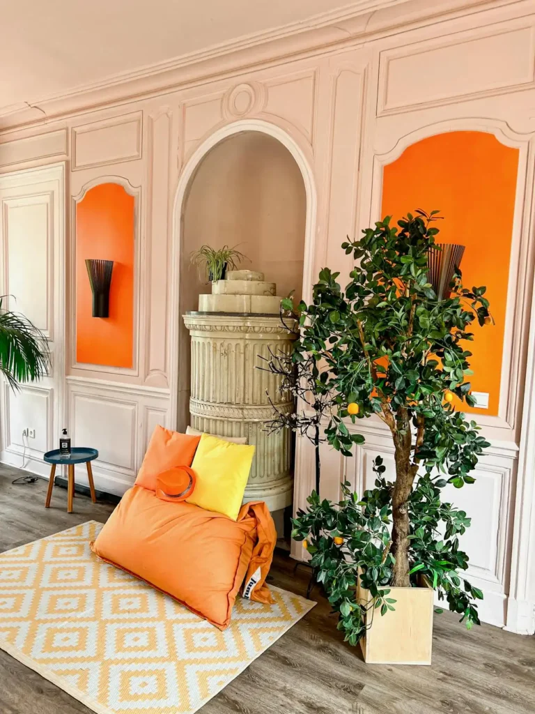
You naturally feel more sociable and outgoing in orange environments because this warm, energetic color promotes communication and interaction.
Orange combines yellow’s cheerfulness with red’s energy, creating a color that encourages conversation and social connection.
This makes orange perfect for family rooms, kitchens, and other gathering spaces where you want people to feel comfortable and engaged.
Soft peach and apricot tones provide orange’s social benefits without overwhelming intensity. You can use these colors to create inviting spaces that naturally draw people together.
These gentle orange shades work beautifully in dining rooms and breakfast areas, where they can stimulate appetite and conversation while maintaining a warm, welcoming atmosphere.
Bright orange works best as an accent color through artwork, throw pillows, or decorative accessories.
This vibrant color adds energy and personality to neutral spaces without becoming overwhelming.
You might choose bright orange for a single accent wall in a playroom or home gym where high energy levels are beneficial.
Burnt orange and terracotta connect you to earth tones while maintaining orange’s warm, social qualities.
These sophisticated orange shades work well with natural materials and can create cozy, grounded spaces that feel both energizing and comfortable for long periods.
How to Apply Color Psychology in Your Home
You can strategically use color psychology to support your daily activities and emotional needs in each room.
Start by considering how you use each space and what emotional state would best support those activities.
Bedrooms need calming colors that promote rest, while home offices benefit from colors that enhance focus and productivity.
Consider the natural light in each room when choosing colors, as lighting affects how colors appear and feel.
North-facing rooms benefit from warm colors that compensate for cooler natural light, while south-facing rooms can handle cooler colors without feeling cold or unwelcoming.
You don’t need to paint entire rooms in psychological colors to gain their benefits.
Accent walls, artwork, textiles, and accessories allow you to incorporate color psychology without overwhelming your space or committing to dramatic changes you might regret later.
Test colors in your actual space before making final decisions, as colors appear different under various lighting conditions and next to your existing furnishings.
Paint large swatches on your walls and observe them at different times of day to ensure you’ll love the color’s psychological effects in your specific environment.
Conclusion
Your color choices create powerful emotional environments that influence your daily mood and behavior.
Choose colors that support your lifestyle and well-being.