27 Best Paint Colors That Beautifully Complement Cherry Wood Furniture
Cherry wood furniture brings timeless elegance to any space with its rich, warm tones and distinctive grain patterns.
But finding the perfect wall color to showcase your beautiful pieces can be challenging.
Whether you’re working with traditional deep cherry or lighter variations, the right paint color can enhance your furniture’s natural beauty while creating a cohesive look in your home.
Ready to transform your space? Let’s explore 27 stunning paint colors that pair perfectly with cherry wood furniture.
1: Sage Green

This muted green creates a natural, calming backdrop that allows cherry wood’s reddish tones to stand out beautifully.
The earthy quality of sage complements the warmth of cherry without competing for attention.
Sage works especially well in living rooms and bedrooms where you want to create a serene atmosphere.
2: Warm Beige

A classic neutral that enhances cherry wood’s richness without overwhelming it.
Warm beige creates a sophisticated foundation that lets your furniture take center stage while maintaining visual harmony.
This versatile shade works in any room and transitions easily between traditional and modern design styles.
3: Soft Gray-Blue

This understated color balances cherry wood’s warmth with cool undertones.
The slight blue inflection creates a pleasing contrast that makes your furniture pop while maintaining an elegant, coordinated look.
Try this in dining rooms or home offices for a refined yet comfortable atmosphere.
4: Creamy Off-White

Pure white can sometimes feel stark against cherry’s richness, but creamy off-white offers the perfect compromise.
This soft neutral brightens your space while allowing the wood’s deep tones to shine.
It creates an airy backdrop that makes rooms feel larger and more open.
5: Taupe

This sophisticated neutral bridges the gap between gray and beige, creating a modern foundation for cherry furniture.
Taupe’s subtle depth adds interest to your walls without competing with your statement pieces.
It works beautifully in transitional spaces that blend traditional and contemporary elements.
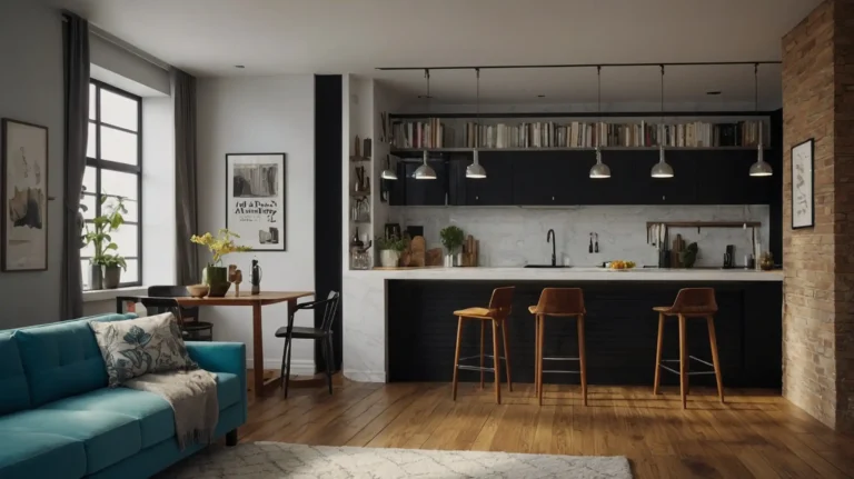
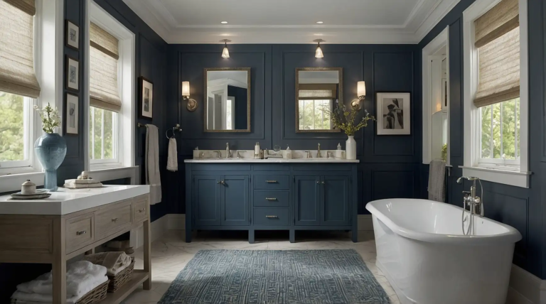
6: Navy Blue

For dramatic contrast that still feels classic, navy blue delivers impressive results.
This rich tone creates a stunning backdrop that makes cherry wood glow while adding sophisticated depth to your space.
Consider navy for living rooms or bedrooms where you want to create a cozy yet elegant environment.
7: Pale Yellow

Soft, buttery yellow enhances cherry wood’s warm undertones while bringing cheerful energy to any room.
This unexpected pairing creates a welcoming atmosphere that feels both fresh and timeless.
Use this sunny shade in kitchens or breakfast nooks to create an inviting gathering place.
8: Olive Green

This earthy, slightly muted green creates a natural harmony with cherry wood.
The complementary relationship between olive’s yellow-green undertones and cherry’s reddish hues creates a balanced, sophisticated palette.
Olive works beautifully in dining rooms and studies for a collected, timeless look.
9: Slate Blue

This medium-toned blue with gray undertones offers enough contrast to make cherry wood stand out while maintaining a serene atmosphere.
Slate blue feels contemporary yet timeless.
It works particularly well in bedrooms and living spaces where you want a calming presence.
10: Warm Greige

This popular blend of gray and beige offers the best of both worlds – the contemporary feel of gray with beige’s warmth.
Greige creates a sophisticated neutral backdrop that allows cherry furniture to shine.
It transitions beautifully between different rooms and lighting conditions.
11: Soft Lavender

This unexpected choice creates a subtle yet distinctive backdrop for cherry wood.
The cool purple undertones balance cherry’s warmth while adding a touch of elegant whimsy to your space.
Try this in guest bedrooms or powder rooms for a memorable impression.
12: Warm Terracotta

Embrace rich, earthy color with terracotta walls that echo cherry wood’s warmth.
This Mediterranean-inspired hue creates a cozy, inviting atmosphere that feels grounded and timeless.
Use it in dining rooms or social spaces where you entertain frequently.
13: Light Aqua

This refreshing blue-green shade offers a cool contrast to cherry’s warmth without feeling jarring.
Light aqua brings a breezy, relaxed feel to spaces while allowing wood tones to stand out beautifully.
Consider this for bedrooms or sunrooms where you want a tranquil atmosphere.
14: Mushroom

This complex neutral with subtle mauve undertones creates sophisticated depth on your walls.
Mushroom’s unique character provides interest without overwhelming your cherry furniture’s natural beauty.
It works exceptionally well in formal living rooms and dining spaces.
15: Pale Moss Green

This soft, muted green creates a natural complement to cherry wood’s reddish tones.
Pale moss offers enough color to feel intentional without overwhelming your furniture’s beautiful grain patterns.
Try this in any room where you want to create a connection to nature.
16: Soft Coral

For a bold yet harmonious pairing, consider soft coral walls.
This warm hue enhances cherry wood’s natural undertones while creating an energetic, welcoming atmosphere in your space.
Use this vibrant choice in dining rooms or social areas to stimulate conversation.
17: Medium Gray

This versatile neutral creates contemporary contrast with cherry wood’s traditional warmth.
Medium gray provides a modern foundation that allows your furniture to stand out as the focal point.
It works particularly well in spaces with abundant natural light.
18: Deep Teal

This rich blue-green creates dramatic contrast with cherry wood while maintaining visual harmony.
Deep teal adds sophisticated color that makes wood tones appear even richer and more luxurious.
Consider this for dining rooms or libraries where you want to create a memorable impression.
19: Soft Wheat

This warm neutral bridges the gap between yellow and beige, creating a sunny backdrop that enhances cherry wood’s natural warmth. Wheat feels traditional yet fresh.
It works beautifully in kitchens, breakfast nooks, and casual living spaces.
20: Dusty Blue

This muted, slightly grayed blue creates elegant contrast with cherry wood’s rich tones.
Dusty blue feels sophisticated and timeless while allowing your furniture to remain the star.
Try this versatile shade in bedrooms or living rooms for a refined atmosphere.
21: Warm Caramel

Embrace a monochromatic approach with caramel walls that echo cherry wood’s warmth while being slightly lighter.
This creates a cozy, enveloping atmosphere that feels luxurious and inviting.
Use this rich neutral in spaces where you want to create intimate, comfortable surroundings.
22: Soft Mint

This refreshing, light green offers enough contrast to make cherry wood pop while maintaining a serene atmosphere.
Mint’s cool undertones balance cherry’s warmth beautifully.
Consider this for sunrooms, breakfast nooks, or other casual living spaces.
23: Warm Pewter

This metallic-inspired neutral bridges the gap between silver and gold tones.
Pewter’s complex character creates sophisticated depth that complements cherry wood’s rich personality.
It works exceptionally well in formal spaces like dining rooms and studies.
24: Colonial Blue

This historic shade creates a traditional backdrop that pairs naturally with cherry furniture.
Colonial blue offers enough color to feel intentional while respecting the classic nature of your pieces.
Try this in spaces where you want to create a timeless, collected atmosphere.
25: Soft Khaki

This versatile neutral with subtle green undertones creates a sophisticated foundation for cherry wood furniture.
Khaki feels both casual and refined, making it perfect for transitional spaces.
Use this adaptable color in family rooms or multipurpose spaces.
26: Blush Pink

For an unexpected yet harmonious pairing, consider blush pink walls.
This subtle, warm-toned pink creates a surprisingly sophisticated backdrop for cherry wood’s rich tones.
Try this in powder rooms, dressing areas, or guest bedrooms for a memorable impression.
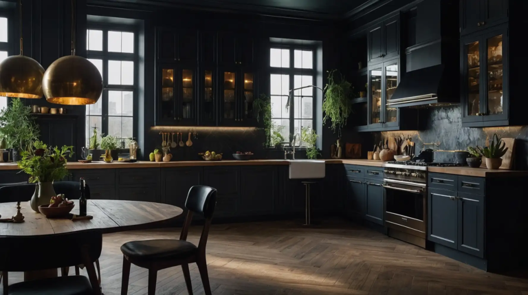
27: Charcoal

Create dramatic contrast with deep charcoal walls that allow cherry wood to stand out brilliantly.
This contemporary choice adds sophisticated depth while highlighting your furniture’s warm glow.
Use charcoal in spaces where you want to create a cozy yet modern atmosphere.
Conclusion
The right paint color transforms how your cherry wood furniture looks in your space.
Choose colors that either complement or contrast with your pieces to create your perfect room atmosphere.