27 Best Paint Colors for Your Office: Transform Your Workspace Today
Choosing the right paint color for your office can dramatically impact your productivity, mood, and creativity.
Whether you’re setting up a home office or refreshing your workplace, the right color can make all the difference.
With so many options available, finding the perfect shade might feel overwhelming.
But don’t worry—we’ve curated this comprehensive list to help you discover the ideal color for your professional space.
Consider factors like natural lighting, office size, and the type of work you do when making your selection.
Ready to transform your workspace? Let’s explore the best office paint colors that combine style and functionality.
1: Classic Off-White
Off-white creates a clean, timeless backdrop that pairs well with any décor style.
This versatile neutral makes your space feel larger and brighter without the harshness of pure white.
It provides the perfect canvas for colorful artwork or furniture to stand out.
Plus, off-white reflects natural light beautifully, helping to maintain a well-lit workspace throughout the day.
2: Soft Sage Green

This calming, nature-inspired hue reduces eye strain and promotes concentration.
Sage green strikes the perfect balance between subtle and interesting, adding character without overwhelming your senses.
Studies show that green hues can reduce workplace anxiety and boost creative thinking. This shade works equally well in traditional and contemporary office settings.
3: Navy Blue
Navy blue exudes professionalism and sophistication while creating a focused atmosphere.
This deep, rich color works wonderfully as an accent wall or throughout smaller office spaces.
It pairs beautifully with brass or gold accents for a polished, executive look. Navy helps minimize distractions and creates a sense of stability during hectic workdays.
4: Warm Greige
Greige—the perfect marriage of gray and beige—offers warmth and neutrality.
This contemporary choice adapts to changing light throughout the day, maintaining a comfortable ambiance.
It complements both cool and warm accent colors, giving you flexibility with your office furniture. Greige creates a sophisticated foundation that never feels cold or sterile.
5: Energizing Coral

Coral infuses your workspace with energy and optimism without being too overwhelming.
This warm, vibrant hue stimulates creativity and conversation, making it ideal for collaborative spaces.
It pairs beautifully with neutrals and natural wood tones. Consider coral for offices that need a mood boost or spaces where innovation is key.
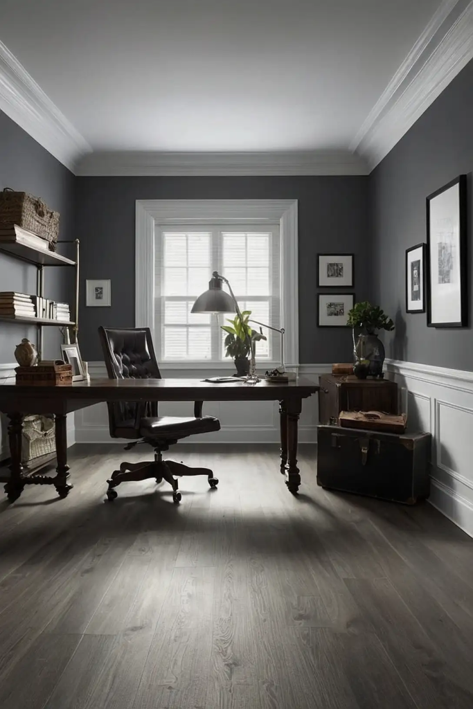
6: Sophisticated Charcoal

Charcoal creates a bold, dramatic backdrop that feels both modern and timeless.
This deep neutral adds depth to your office while maintaining a professional atmosphere.
It works particularly well in well-lit spaces with ample natural light. Pair charcoal with bright white trim and colorful accents for a balanced, designer-worthy look.
7: Pale Blue
Pale blue evokes clear skies and open spaces, helping to reduce stress and promote clear thinking.
This soft, versatile color creates a sense of tranquility in busy work environments.
Research shows blue tones can improve focus and productivity. Light blue works especially well in windowless offices or spaces that need to feel more expansive.
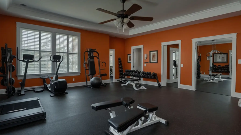
8: Warm Terracotta
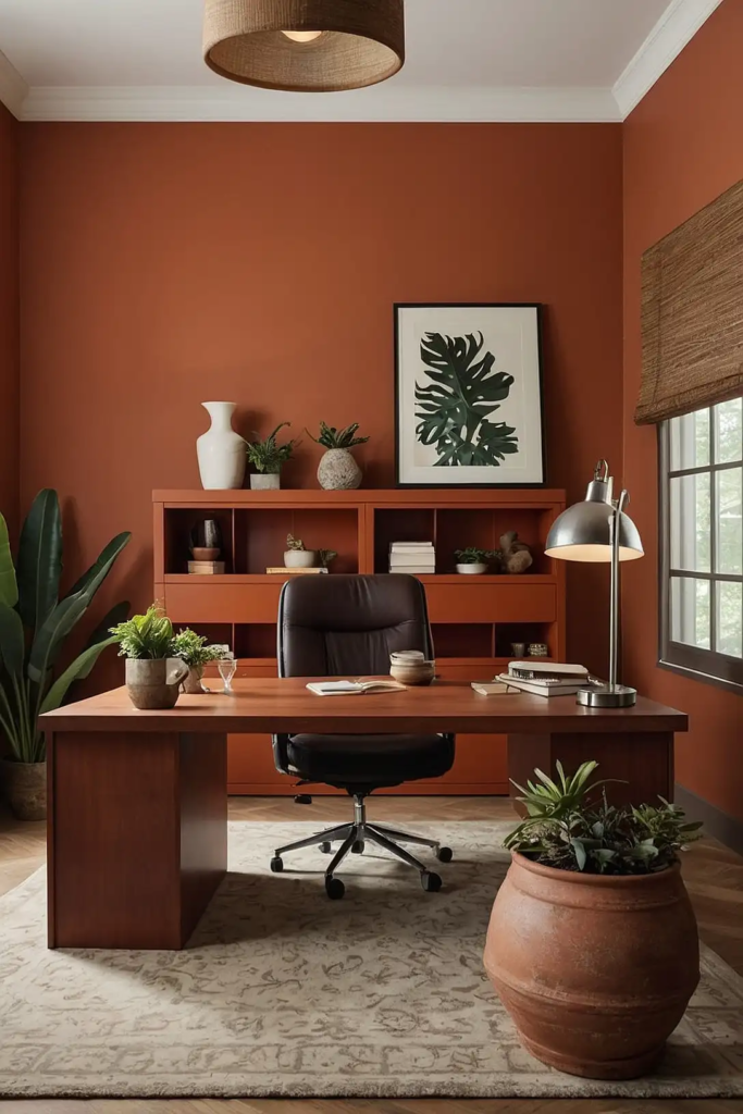
Terracotta brings warmth and earthy elegance to any office space. This rich, organic hue creates a welcoming atmosphere that feels both grounding and inspiring.
It pairs beautifully with natural materials like wood, leather, and brass.
Consider terracotta for creative spaces or offices where you want to foster connection and comfort.
9: Muted Lavender

Lavender combines the calming properties of blue with the creativity-boosting aspects of purple.
This soft, unexpected choice adds subtle interest without becoming distracting.
It creates a soothing environment that can help reduce workplace stress. Lavender pairs particularly well with gray, cream, or wood tones for a balanced look.
10: Rich Emerald Green

Emerald green creates a luxurious, biophilic connection to nature in your workspace.
This jewel tone promotes concentration while adding a touch of sophistication and energy.
It works beautifully as an accent wall or in well-lit spaces. Pair emerald with brass fixtures and neutral furnishings for a timeless, upscale office aesthetic.
11: Soft Taupe
Taupe offers understated elegance and versatility for any office environment.
This complex neutral has subtle undertones that change with the lighting, adding depth and interest.
It creates a warm foundation that pairs well with virtually any accent color. Taupe is particularly effective in spaces where you need to maintain focus without distraction.
12: Energetic Yellow

Yellow infuses your workspace with optimism, creativity, and mental alertness. This sunny hue is perfect for brainstorming areas or spaces where innovation is essential.
Use it thoughtfully—an accent wall or subtle yellow undertones work best. This color shines in offices with northern exposure that need warming up.
13: Slate Blue-Gray

Slate blue-gray combines professionalism with a touch of color for the perfect balance.
This sophisticated hue promotes concentration while feeling more interesting than basic gray.
It adapts well to changing light conditions throughout the day. Slate works particularly well in traditional offices seeking a contemporary update.
14: Warm Ivory
Ivory offers the brightness of white with a softer, more inviting quality. This timeless neutral creates a warm, welcoming foundation for any office style.
It reflects light beautifully without the starkness of pure white. Ivory pairs effortlessly with both bold accent colors and subtle neutrals for flexible decorating options.
15: Dusty Teal
Teal balances the calming properties of blue with the refreshing qualities of green.
This sophisticated mid-tone adds character while maintaining a professional atmosphere.
It works well in creative environments or spaces needing a distinctive look. Teal pairs beautifully with wood tones, brass, or copper accents for a refined aesthetic.
16: Light Pewter Gray
Pewter gray provides a modern neutral base that feels both contemporary and timeless. This versatile shade adapts to your existing furniture and changing design trends.
It creates a sophisticated backdrop that allows your work to remain the focus. Pewter works especially well in spaces that need to feel polished and pulled-together.
17: Soft Blush Pink

Blush pink introduces a subtle warmth that promotes creativity without becoming too feminine.
This contemporary neutral pairs beautifully with grays, blacks, and metallics for balance.
Research shows pink environments can initially reduce stress and anxiety. Consider blush for meeting rooms or spaces where you want to create a welcoming atmosphere.
18: Crisp Mint Green

Mint green creates a fresh, invigorating environment that promotes clarity and focus.
This rejuvenating hue brings the benefits of nature indoors without overwhelming the space.
It works especially well in smaller offices or rooms that need to feel more spacious. Mint pairs beautifully with white, wood tones, or gray for a balanced look.
19: Classic Camel

Camel brings warmth and timeless sophistication to any office environment. This rich neutral creates a welcoming atmosphere while maintaining professionalism.
It pairs beautifully with leather, wood, and brass for a cohesive, executive look. Camel works particularly well in offices aiming for a refined, library-inspired aesthetic.
20: Pale Dove Gray

Dove gray offers a soft, versatile neutral that feels both modern and timeless.
This understated color creates a calm backdrop that enhances focus and reduces visual noise.
It adapts beautifully to changing light throughout the day. Dove gray pairs well with virtually any accent color, giving you flexibility with your office accessories.
21: Deep Burgundy

Burgundy creates a rich, sophisticated environment that exudes confidence and focus. This classic color adds warmth and depth without the starkness of black or charcoal.
It works particularly well in executive offices or conference rooms. Use burgundy thoughtfully—an accent wall often provides just the right amount of this powerful color.
22: Soft Butter Yellow

Butter yellow creates a subtle warmth that energizes without overwhelming your senses. This gentle hue promotes optimism and creativity while remaining professional.
It brightens spaces with limited natural light, creating a welcoming glow. Butter yellow pairs beautifully with navy, gray, or white for a balanced office palette.
23: Muted Olive Green

Olive green brings the calming effects of nature indoors with sophisticated undertones.
This earthy hue creates a grounding environment that promotes concentration and balance.
It connects beautifully with natural elements like wood, leather, and plants. Olive works well in both traditional and contemporary office settings.
24: Soft Periwinkle

Periwinkle combines the focus-enhancing benefits of blue with the creative energy of purple.
This unique color creates an inspiring yet calming atmosphere for productive work.
It adds interest without becoming distracting or overwhelming. Periwinkle pairs well with warm neutrals or gray for a balanced, contemporary office palette.
25: Classic Khaki

Khaki offers a warm neutral that creates a professional yet approachable environment. This versatile color works with virtually any design style, from traditional to modern.
It hides marks and scuffs better than lighter neutrals, making it practical for busy offices.
Khaki creates a sophisticated foundation that pairs well with both bold and subtle accents.
26: Soft Aqua
Aqua creates a refreshing, water-inspired environment that reduces stress and promotes clear thinking.
This versatile blue-green hue brightens your space while maintaining professionalism.
It works particularly well in offices seeking a coastal or biophilic connection. Aqua pairs beautifully with white, wood tones, or deeper blues for a cohesive look.
27: Rich Chocolate Brown

Chocolate brown creates a cozy, grounding environment that feels both elegant and approachable. This rich neutral adds depth and warmth without sacrificing sophistication.
It works beautifully in spaces with ample natural light or as an accent wall. Chocolate pairs wonderfully with cream, blue, or sage green for a balanced office palette.
Conclusion
The right office paint color can transform your workspace from ordinary to extraordinary.
Select a shade that aligns with your work style, enhances productivity, and creates your ideal environment.