27 Best Paint Colors for Small Spaces: Transform Your Tiny Room into a Spacious Haven
Looking to make your cramped apartment feel like a palace?
The right paint color can work wonders in small spaces, creating the illusion of depth and airiness where square footage is lacking.
We’ve rounded up the 27 best paint colors that can transform your tiny room into a seemingly spacious sanctuary.
From cool neutrals to unexpected bold choices, these expert-recommended shades will help your compact space feel instantly larger.
Ready to maximize your minimal square footage with just a paintbrush? Let’s dive into the perfect palette for small-space living.
1: Crisp White (Benjamin Moore “White Dove”)

This soft, clean white reflects light beautifully without appearing stark or clinical. White Dove creates a blank canvas that makes your space feel instantly more open and airy.
It pairs beautifully with virtually any accent color and allows your furniture and accessories to stand out.
The subtle warmth in this white prevents your space from feeling cold or sterile.
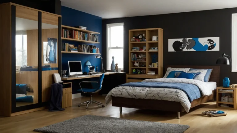
2: Pale Blue-Gray (Sherwin-Williams “Misty”)

This ethereal shade sits perfectly between blue and gray, creating a light, airy feeling that recedes visually. Misty adds subtle color without overwhelming small spaces.
The cool undertones help create depth while maintaining brightness.
It works exceptionally well in rooms with limited natural light, providing a sense of openness even on cloudy days.
3: Soft Sage Green (Behr “Soft Sage”)

This gentle, earthy green brings nature indoors while keeping walls light enough to maximize space.
Soft Sage provides a soothing backdrop that makes small rooms feel more serene and expansive.
The muted quality of this shade prevents it from overwhelming tight quarters. It pairs beautifully with natural wood tones and cream accents for a cohesive look.
4: Warm Greige (Benjamin Moore “Revere Pewter”)

This perfect neutral balances warm beige and cool gray, creating depth without darkness. Revere Pewter adapts beautifully to changing light conditions throughout the day.
Its versatility makes it ideal for open concept small spaces.
This chameleon-like color creates a sophisticated foundation that makes your space feel more substantial and grounded.
5: Light Blush Pink (Sherwin-Williams “Romance”)

This barely-there pink adds subtle warmth without feeling overly feminine or juvenile. Romance acts almost as a neutral but provides more character than basic white.
The warm undertones create a flattering glow that makes the space feel more inviting.
It works especially well in bedrooms and bathrooms, creating an expanded, cozy atmosphere.
6: Pale Lavender (Benjamin Moore “Lavender Mist”)

This whisper-soft purple creates a peaceful atmosphere while visually expanding your walls. Lavender Mist provides unexpected character without closing in your space.
The cool undertones help create a sense of airiness and breathing room. This shade works particularly well in spaces lacking abundant natural light.
7: Soft Taupe (Sherwin-Williams “Agreeable Gray”)
This versatile light brown-gray creates warmth without visual heaviness. Agreeable Gray adapts beautifully to different lighting conditions throughout the day.
Its neutral character allows your furnishings and décor to take center stage. This failproof shade works in virtually any room and with any design style.
8: Pale Mint (Behr “Mint Condition”)
This fresh, clean green adds subtle color while keeping things light and bright.
Mint Condition creates a refreshing atmosphere that makes small spaces feel more open.
The cool undertones help walls recede visually, creating more perceived space. It pairs beautifully with white trim and natural textures for a cohesive look.
9: Light Powder Blue (Benjamin Moore “Blue Veil”)

This barely-there blue creates a sense of expanded space reminiscent of open skies.
Blue Veil provides a soft, atmospheric quality that makes walls seem to disappear.
The cool undertones prevent the space from feeling closed-in or cramped. This shade works beautifully in bedrooms, bathrooms, and living spaces alike.
10: Soft Peach (Sherwin-Williams “Delicate White”)
This warm neutral with barely-there peach undertones creates a flattering glow.
Delicate White adds warmth without overwhelming small spaces or appearing too orange.
The subtle color adds character while maintaining an open, airy feel. It works especially well in spaces with northern exposure that need warming up.
11: Light Gray-Blue (Benjamin Moore “Smoke”)

This sophisticated hue bridges the gap between gray and blue for versatile appeal. Smoke creates depth without darkness, making small rooms feel more dimensional.
The cool undertones help walls visually recede, expanding your space. This adaptable shade works with virtually any decorating style from traditional to modern.
12: Creamy Off-White (Sherwin-Williams “Alabaster”)

This soft, warm white avoids looking clinical while maximizing light reflection. Alabaster creates a sense of expansiveness without the starkness of pure white.
The subtle warmth makes spaces feel more inviting and less boxy. It serves as a perfect backdrop for colorful art and accessories in tight quarters.
13: Pale Aqua (Benjamin Moore “Beach Glass”)
This light, watery blue-green evokes spacious oceanfront views. Beach Glass creates a refreshing atmosphere that makes rooms feel naturally larger.
The cool undertones help visually push walls outward.
This versatile shade works well in any room where you want to create a sense of expanded space.
14: Light Mushroom (Farrow & Ball “Elephant’s Breath”)

This sophisticated greige with subtle purple undertones adds depth without heaviness.
Elephant’s Breath changes beautifully throughout the day, adding dimension to small spaces.
Its neutral versatility complements most color schemes and decorating styles. This elevated neutral makes compact spaces feel more substantial and designed.
15: Cloud Gray (Benjamin Moore “Gray Owl”)
This airy, light gray has subtle blue undertones that create a sense of expansiveness. Gray Owl provides a perfect backdrop that makes small spaces feel more open.
The cool undertones help walls recede visually without feeling cold.
This versatile neutral works in any room and adapts to changing light throughout the day.
16: Pale Khaki (Sherwin-Williams “Accessible Beige”)
This light, sophisticated beige adds warmth without visual heaviness. Accessible Beige creates a neutral backdrop that helps a small space feel more substantial.
The warm undertones prevent the room from feeling stark or unwelcoming.
This versatile shade complements virtually any accent color or decorating style.
17: Soft Sky Blue (Benjamin Moore “Breath of Fresh Air”)

This ethereal blue creates an atmosphere reminiscent of boundless skies.
Breath of Fresh Air makes walls seem to disappear, creating a sense of openness.
The light-reflective quality brightens up dark corners in small spaces. This serene shade works particularly well in bedrooms and bathrooms.
18: Warm Cream (Sherwin-Williams “Creamy”)
This soft, warm white avoids yellow undertones while maintaining a cozy feel. Creamy reflects light beautifully without appearing stark or sterile.
The subtle warmth creates an inviting atmosphere in tight quarters.
It serves as a perfect backdrop for colorful accents in small spaces.
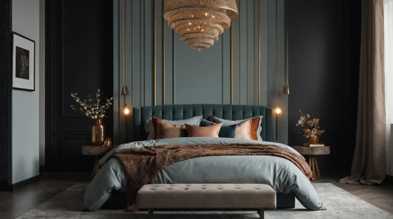
19: Dusty Blue (Benjamin Moore “Boothbay Gray”)
This sophisticated blue-gray adds character without overwhelming small spaces. Boothbay Gray creates depth and interest while maintaining visual spaciousness.
The muted quality prevents it from feeling too bold or space-reducing.
This versatile shade works well in living areas, bedrooms, and bathrooms alike.
20: Pale Yellow (Benjamin Moore “Lemon Chiffon”)

This barely-there yellow adds subtle sunshine without overwhelming small spaces. Lemon Chiffon creates a cheerful atmosphere that makes rooms feel more open.
The light-reflective quality helps brighten dark corners and tight spaces.
This happy hue works particularly well in kitchens and breakfast nooks.
21: Soft Charcoal (Sherwin-Williams “Repose Gray”)

This mid-tone neutral appears to change with the light, adding dimension.
Repose Gray creates sophistication without the heaviness of darker charcoals.
The balanced undertones work well in virtually any lighting condition. This versatile shade pairs beautifully with brighter whites for contrast in small spaces.
22: Misty Lilac (Benjamin Moore “Pink Bliss”)

This barely-there purple creates an ethereal, expanded feeling in tight quarters.
Pink Bliss adds subtle character without visually closing in your space.
The soft undertones create a flattering, atmospheric quality. This unexpected neutral works beautifully in bedrooms and sitting areas.
23: Pale Celery Green (Sherwin-Williams “Softened Green”)

This light, natural green brings the outdoors in while maintaining visual spaciousness. Softened Green creates a fresh, airy feel in compact spaces.
The yellow undertones add warmth without overwhelming small rooms.
This versatile shade works particularly well in kitchens and dining areas.
24: Light Oyster (Benjamin Moore “Classic Gray”)

This sophisticated pale gray has warm undertones that prevent it from feeling cold. Classic Gray creates a sense of expanded space while maintaining interest.
The subtle warmth makes small spaces feel more inviting and less clinical.
This failproof neutral works beautifully in any room of your home.
25: Soft Turquoise (Sherwin-Williams “Tidewater”)

This light blue-green creates a sense of expansive ocean views. Tidewater adds personality without overwhelming small spaces or feeling too bold.
The cool undertones help walls visually recede, making rooms feel larger. This refreshing shade works beautifully in bathrooms and bedrooms.
26: Pale Dove Gray (Benjamin Moore “Balboa Mist”)

This light, versatile gray with warm undertones adapts to changing light. Balboa Mist creates sophistication without heaviness in small spaces.
The subtle warmth prevents it from feeling cold or unwelcoming.
This chameleon-like neutral works in any room and complements most decorating styles.
27: Crisp Ivory (Sherwin-Williams “Greek Villa”)

This clean, bright off-white reflects light beautifully without yellow undertones.
Greek Villa creates an airy, expanded feel in even the smallest spaces.
The subtle warmth makes it more interesting than pure white. This versatile neutral creates the perfect backdrop for any decorating style.
Conclusion
The right paint color transforms your small space from cramped to cozy.
Experiment with these shades to find your perfect match, and watch your tiny room expand before your eyes.