The Best Shelf Styling Formula Designers Use
You’ve probably stared at your empty shelves wondering how interior designers make styling look so effortless.
The secret isn’t magic—it’s following proven formulas that create visual harmony every time.
These designer-tested techniques will transform your shelves from cluttered chaos into magazine-worthy displays.
The Foundation: Start with Your Anchor Pieces
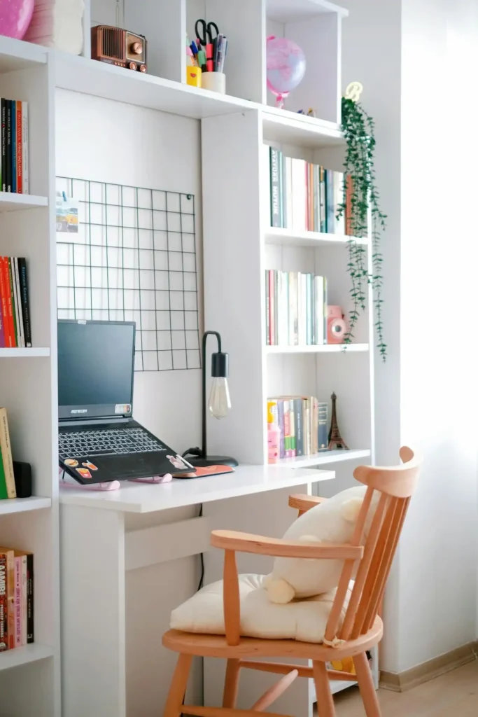
Every successful shelf design begins with anchor pieces. These are your largest, most substantial items that ground the entire display.
Think oversized books, tall vases, or statement sculptures. Place your anchor pieces first, spacing them evenly across your shelves.
This creates a strong foundation that prevents your styling from looking top-heavy or unbalanced. You’ll use these pieces as reference points for everything else you add.
Professional designers always start with anchors because they establish the visual weight distribution.
Without this foundation, even the most beautiful accessories can look scattered and purposeless.
The Rule of Thirds: Your Secret Weapon
Interior designers swear by the rule of thirds for shelf styling. Divide each shelf mentally into three sections, then place objects accordingly.
This creates natural focal points that draw the eye across your display. You don’t need to fill each third equally. Instead, vary the visual weight between sections.
Place a heavy anchor piece in one third, medium-sized items in another, and leave the final section lighter or empty.
This technique works because our brains naturally find odd-numbered groupings more pleasing than even numbers.
When you apply the rule of thirds, you’re working with human psychology to create displays that feel inherently balanced.
The rule extends vertically too. If you have three shelves, treat the entire unit as one large canvas divided into thirds.
Place your most eye-catching pieces in the upper and lower thirds, with supporting elements in the middle.
Height Variation: The Designer’s Best Friend
Nothing screams amateur like shelves filled with objects of identical height. Professional designers create visual interest by mixing tall, medium, and short pieces throughout their displays.
Start with your tallest items and work your way down. Place tall objects next to shorter ones to create pleasing contrasts.
This technique guides the eye naturally across your shelves rather than letting it get stuck in one spot.
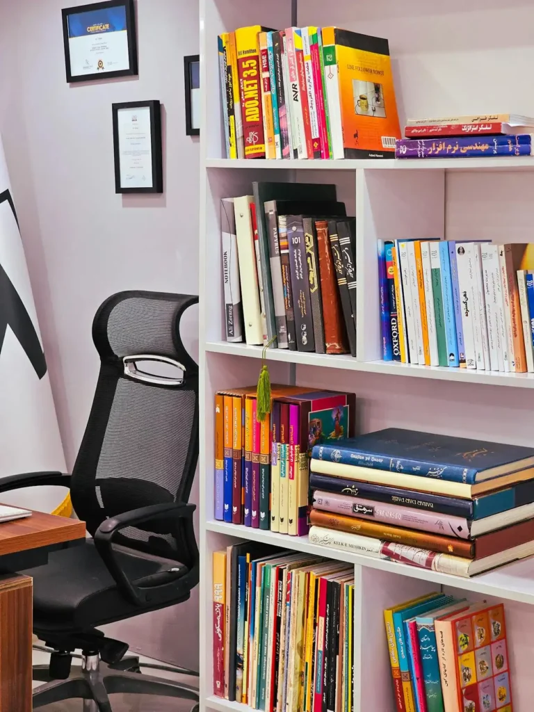
Books offer the perfect opportunity to play with height. Stack some horizontally to create pedestals for smaller objects.
Mix vertical and horizontal book placement to break up monotony and add architectural interest. Remember that height variation applies to the spaces between objects too.
Vary the gaps between items—some tight, some generous. This creates rhythm and prevents your display from looking like a rigid lineup.
The Power of Odd Numbers
Designers religiously follow the odd-number rule when grouping accessories. When you group three items together, arrange them in a triangle formation.
Groups of three, five, or seven objects create more dynamic and visually interesting arrangements than even-numbered groupings.
Place the tallest item in back, with the two shorter pieces flanking it at different distances. This creates depth and prevents the grouping from looking flat.
Five-item groupings work beautifully for larger shelves. Create a main cluster of three items, then place two additional pieces nearby but slightly separated.
This maintains the odd-number principle while filling more space naturally. This subtle detail makes a significant difference in the overall sophistication of your display.
The odd-number rule applies to color groupings too. If you’re using blue accessories, place them in groups of three rather than pairs.
Color Strategy: Creating Cohesion
Professional designers approach shelf styling with a clear color strategy. You have three main options: monochromatic, analogous, or complementary color schemes.
Monochromatic schemes use different shades of the same color. This creates a sophisticated, cohesive look that’s nearly impossible to mess up.
Think various shades of blue from navy to powder, or warm whites from cream to ivory. Complementary colors oppose each other on the color wheel.
Analogous colors sit next to each other on the color wheel—like blue and green, or orange and red.
These combinations feel harmonious and natural, perfect for creating calm, pleasing displays.
Use this approach sparingly, with one color dominating and its complement appearing as small accent pieces.
Too much contrast can overwhelm your shelves. This repetition creates visual connections that tie everything together.
Whatever color strategy you choose, repeat colors throughout your display. If you use coral in one corner, echo it somewhere else on your shelves.
Texture and Material Mixing
The most sophisticated shelf displays combine multiple textures and materials. Natural materials like wood, stone, and plants bring warmth to your displays.
Smooth ceramic next to rough woven baskets, shiny metal beside matte wood—these contrasts add depth and interest.
Aim for three to four different textures per shelf grouping. More than this becomes chaotic, while fewer feels flat and boring.
Consider the texture of your shelf material too—wooden shelves call for different treatments than glass or metal ones.
Balance these with man-made materials like ceramics, metals, or glass for sophisticated contrast.
Don’t forget about book spines when considering texture. Leather bindings, glossy dust jackets, and fabric covers all contribute to your overall texture story. Use this variety strategically rather than randomly.
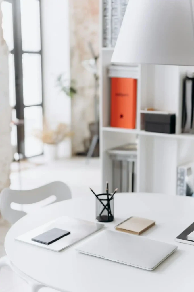
Negative Space: The Element You’re Forgetting
Beginning stylists often try to fill every inch of their shelves. Professional designers know that negative space—the empty areas—are just as important as the objects themselves.
Negative space gives your eyes places to rest and prevents your displays from feeling cluttered. Aim to leave about 30-40% of your shelf space empty.
This might feel uncomfortable at first, but it’s essential for sophisticated styling. Surround groupings with breathing room to define them clearly.
Use negative space strategically to highlight your most important pieces. Frame a beautiful vase with empty space on both sides to make it the focal point.
The shape of your negative space matters too. Avoid creating uniform gaps between objects. Instead, vary the spacing to create organic, interesting rhythms across your shelves.
Layering and Depth Techniques

Flat displays against the back wall look amateur. Professional designers create depth by layering objects at different distances from the shelf edge.
Place some items at the very back, others in the middle, and a few near the front edge. This three-dimensional approach makes your shelves look full and interesting from multiple angles.
Use books as risers to elevate smaller objects and create additional layers. These subtle overlaps create natural, organic-looking arrangements.
Stack two or three books horizontally, then place a small sculpture or plant on top. This technique adds height variation and depth simultaneously.
Overlap objects slightly when possible. Let a trailing plant drape in front of books, or position a small frame partially behind a larger object.
Personal Touches: Making It Yours
While formulas provide structure, personal elements make your shelves unique. Professional designers always incorporate meaningful objects that tell their clients’ stories.
Include items that reflect your interests, travels, or family history. A collection of vintage cameras, seashells from favorite beaches, or family photos add personality that no formula can provide.
Mix these personal pieces with more neutral decorative objects. The neutral items provide sophisticated backdrop, while your personal touches add character and warmth.
Remember that personal doesn’t mean cluttered. Choose your most meaningful pieces rather than displaying everything you own. Quality over quantity creates more impactful displays.
Lighting Considerations
Proper lighting transforms good shelf styling into great shelf styling. Consider how natural and artificial light hits your shelves throughout the day.
Reflective objects like mirrors, metallic accessories, or glass pieces can bounce light around your room. Position these strategically to brighten dark corners or highlight other objects.
If your shelves have built-in lighting, use it to create drama. Light from below or above adds sophisticated ambiance and draws attention to your displays after dark.
Avoid placing light-sensitive items like photographs or delicate fabrics in direct sunlight. Instead, use these spots for items that benefit from natural light, like plants or crystals.
Seasonal Refresh Strategy
Professional designers refresh their shelf displays seasonally to keep them feeling current and interesting. You don’t need to start from scratch—small changes make big impacts.
Swap out a few key accessories with seasonal pieces. Replace summer’s coral objects with autumn’s warm oranges, or switch spring’s pastels for winter’s deeper tones.
Plants offer the easiest seasonal updates. Flowering bulbs in spring, tropical plants in summer, colorful leaves in fall, and evergreen branches in winter keep your displays fresh year-round.
Use seasonal refresh as an opportunity to edit your displays. Remove pieces that no longer serve your design, and introduce new finds that fit your established color and style scheme.
Common Mistakes to Avoid
Even with the best formulas, certain mistakes can derail your shelf styling efforts. Matching everything too closely looks sterile and lacks personality.
Pushing everything against the back wall creates flat, uninteresting displays. Pull objects forward and create depth instead.
Professional designers embrace controlled chaos—objects that coordinate without being identical twins.
Ignoring scale relationships between objects creates visual confusion. Forgetting about the view from different angles is another common error.
A tiny vase next to a massive sculpture looks awkward, while similar-sized objects can appear boring. Aim for pleasing scale relationships throughout your display.
Your shelves should look good from wherever people might see them—straight on, from the side, or from across the room.
Maintenance and Evolution
Great shelf styling isn’t a one-time project. Professional designers understand that displays need regular attention to maintain their impact.
Dust your objects regularly and rearrange them occasionally. Even moving a few pieces to new positions can refresh your entire display without requiring new purchases.
As you acquire new objects, integrate them thoughtfully rather than just finding empty spots. Consider how each addition affects your overall composition, color balance, and style story.
Don’t be afraid to edit ruthlessly. If something isn’t working, remove it. Professional designers constantly refine their displays, keeping only what serves the overall vision.
Conclusion
These designer formulas transform any shelf into a sophisticated display that reflects your personal style while maintaining professional polish.
Start with these proven techniques and adjust them to suit your unique space and preferences.