How to Choose Wall Art That Complements Your Space
You stare at those blank walls, knowing they need something special but feeling overwhelmed by endless options.
Choosing the right wall art transforms your space from ordinary to extraordinary.
The key lies in understanding how art interacts with your room’s existing elements to create harmony and visual appeal.
Consider Your Room’s Purpose and Mood
Your living room serves a different purpose than your bedroom, and your wall art should reflect these functional differences.
You want pieces that enhance the intended atmosphere of each space.
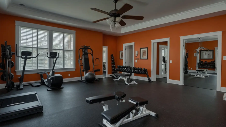
A vibrant abstract painting might energize your home office, while soft landscapes create tranquility in your bedroom.
Think about how you use each room throughout the day. Your kitchen might benefit from cheerful, food-inspired artwork that makes cooking more enjoyable.
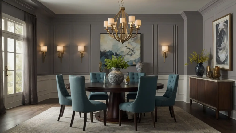
Your dining room could showcase sophisticated pieces that spark conversation during dinner parties.
The mood you want to create should guide your artistic choices. Consider who spends time in each room.
Do you prefer spaces that feel calm and serene, or do you thrive in environments with bold, stimulating visuals? Your personality should shine through in your art selection.
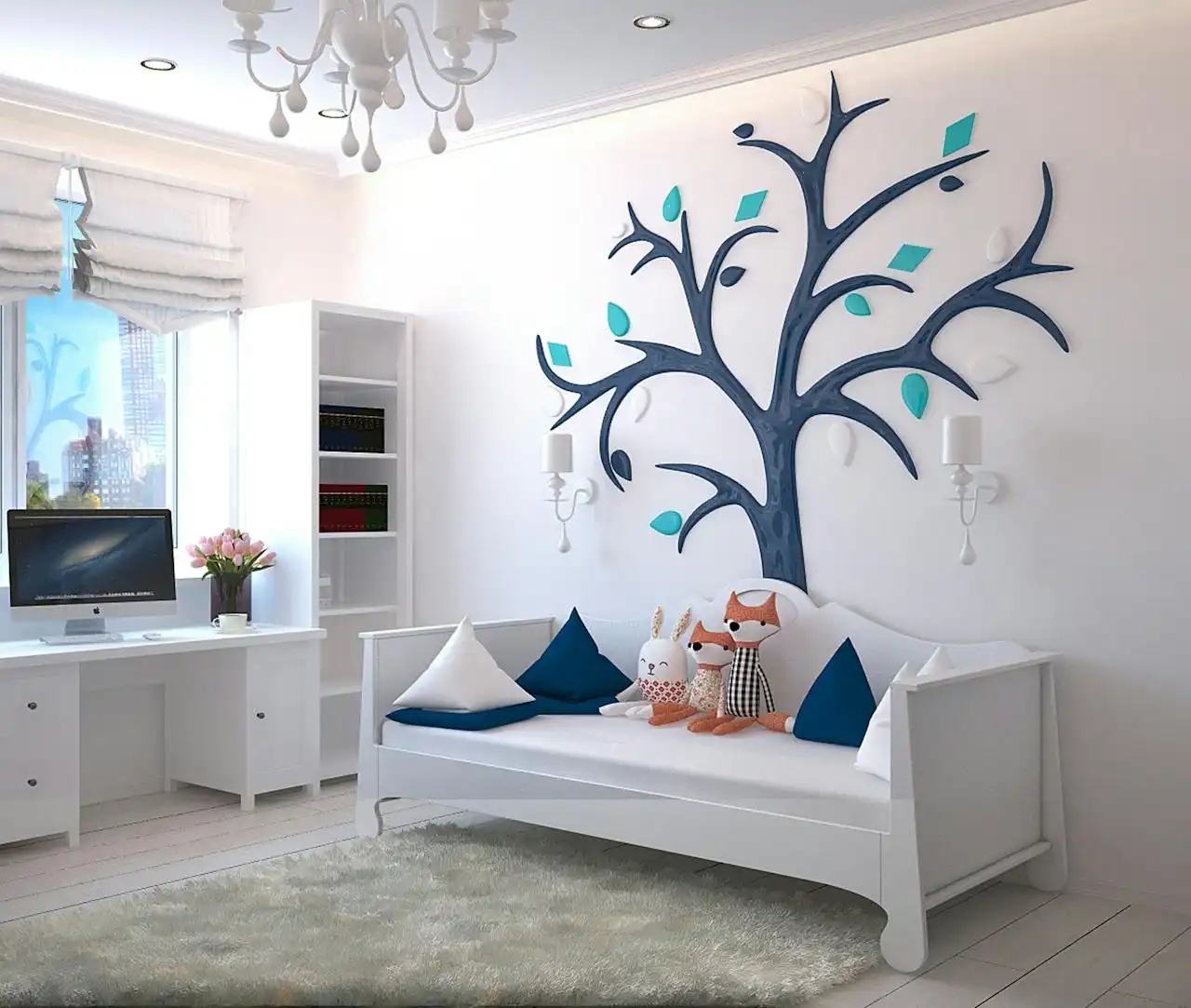
Family spaces might call for pieces that appeal to various age groups, while your private study can reflect your personal interests more specifically.
Understand Scale and Proportion
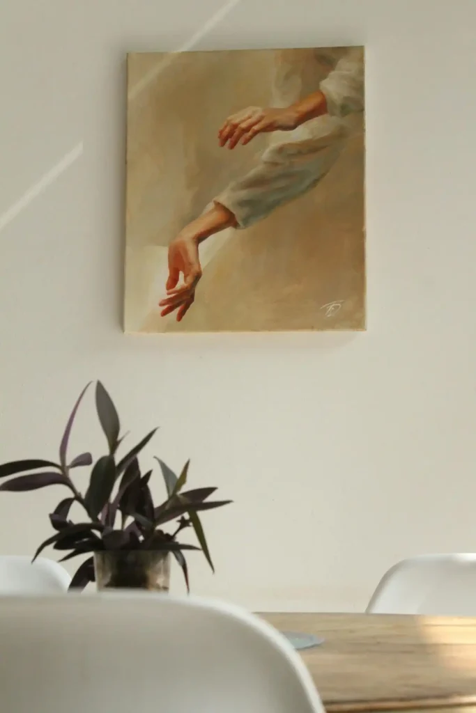
Size matters tremendously when selecting wall art. A tiny print on a large wall disappears and fails to make any impact.
Conversely, an oversized piece in a small room can overwhelm the space and make it feel cramped.
You should aim to fill about two-thirds to three-quarters of your available wall space. For artwork above furniture, choose pieces that span roughly 60-75% of the furniture’s width.
This creates visual balance and prevents your art from looking lost or disconnected. You can mix different sizes within a collection to add visual interest and dynamic energy.
Consider the height of your ceilings when making size decisions. Rooms with high ceilings can accommodate larger, more dramatic pieces.
Lower ceilings work better with horizontal compositions that draw the eye sideways rather than upward.
Don’t forget about groupings and gallery walls. Multiple smaller pieces can create the same visual impact as one large artwork when arranged thoughtfully.
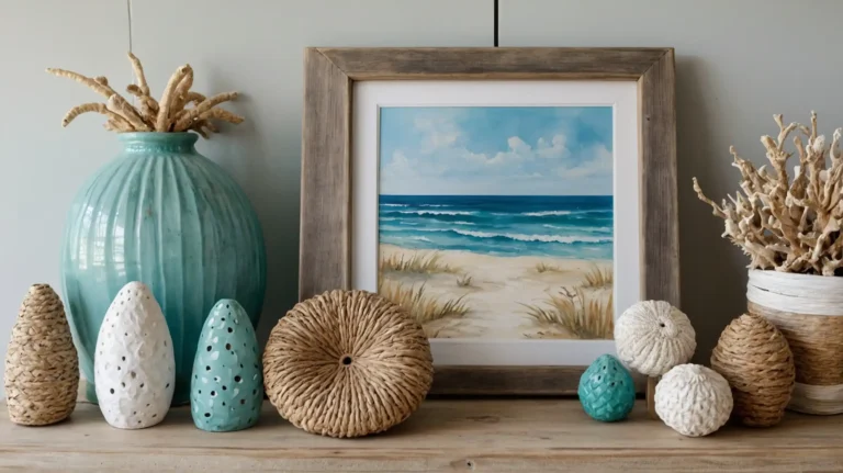
Work with Your Color Palette
Your existing color scheme provides the foundation for smart art choices. Look for pieces that incorporate at least one color already present in your space.
You don’t need to match colors exactly, but your artwork should harmonize with your room’s dominant hues.
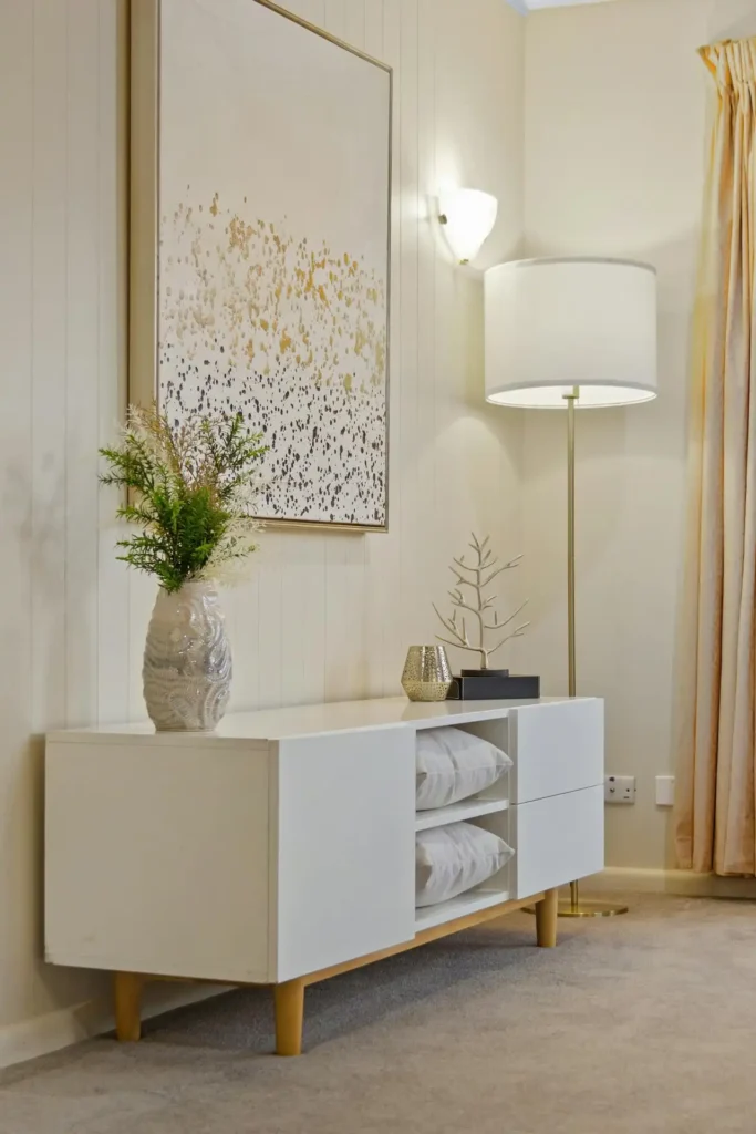
Consider using art to introduce accent colors that appear in your pillows, throws, or accessories. This creates a cohesive look that ties all your decorative elements together.
A painting with touches of your accent color can strengthen your overall design scheme.
You can also use artwork to add a pop of complementary color that creates visual excitement.
If your room features mostly cool blues and grays, a piece with warm orange or yellow accents can provide stunning contrast without clashing.
Think about the emotional impact of different colors. Warm colors like reds, oranges, and yellows create energy and intimacy.
Cool colors like blues, greens, and purples promote calm and relaxation. Choose colors that support the mood you want to establish.
Choose the Right Style for Your Space
Your home’s architectural style and existing decor should influence your art selection. A sleek, modern apartment calls for different pieces than a rustic farmhouse or traditional colonial home.
You want your artwork to feel like a natural extension of your space rather than an afterthought.
Contemporary spaces often benefit from abstract pieces, minimalist photography, or bold graphic prints.
Traditional homes might showcase classic landscapes, portraits, or still-life paintings. Your personal taste should ultimately guide your decisions.
However, don’t feel restricted by these conventions – thoughtful contrasts can create compelling visual dialogue.
Consider mixing styles strategically to add personality and prevent your space from feeling too matched or sterile.
A vintage poster in a modern frame can bridge different design eras beautifully. An antique painting in a contemporary setting creates intriguing juxtaposition.
If you love a piece and it speaks to you, you can usually find ways to make it work within your existing décor through careful placement and thoughtful styling.
Think About Lighting and Placement
Lighting dramatically affects how your artwork appears throughout the day. You need to consider both preservation and presentation.
Natural light can fade certain prints and paintings over time, while insufficient lighting can make even stunning pieces look dull and lifeless.
Position valuable or light-sensitive pieces away from direct sunlight. UV-filtering glass can protect important artwork while still allowing you to display it prominently.
Track lighting or picture lights can highlight your favorite pieces and create dramatic focal points.
Eye level placement generally works best for most artwork. The center of your piece should sit at about 57-60 inches from the floor.
However, you can adjust this height based on your room’s proportions and the viewing angle from your main seating areas.
Consider the room’s traffic flow when positioning artwork. Pieces in hallways or entryways get viewed differently than those in intimate seating areas.
You might choose more dramatic or attention-grabbing pieces for high-traffic areas where people pass quickly.
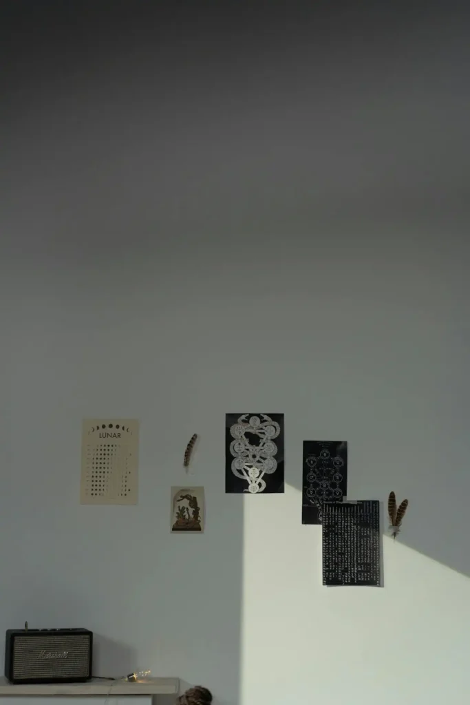
Mix and Match Different Types of Art
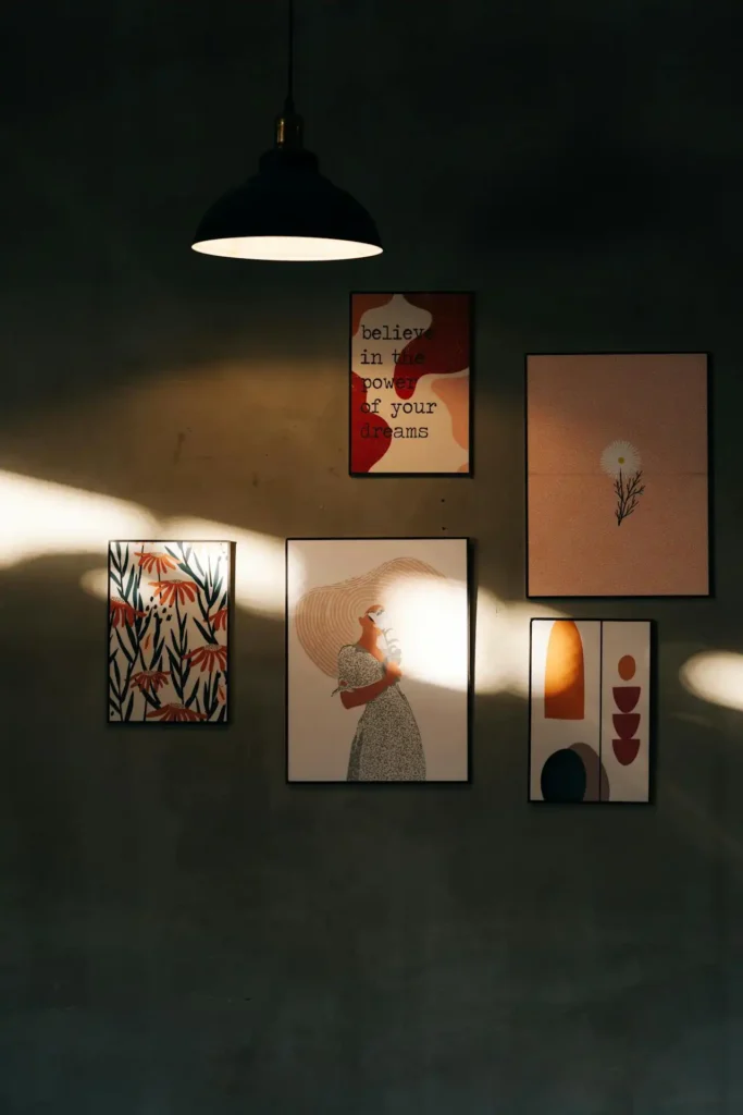
Variety adds visual interest and prevents your walls from looking monotonous. The key lies in finding common elements that tie different pieces together.
You can successfully combine paintings, photographs, prints, sculptures, and even textile art within the same space.
Color serves as an excellent unifying factor when mixing different art types. Similarly, pieces that share warm or cool tones create harmony despite different mediums.
A black-and-white photography collection can work beautifully with charcoal drawings and ink paintings.
Consider varying the frame styles while maintaining some consistency. All-white frames create a clean, gallery-like appearance.
Mixed frame styles in the same color family add personality while maintaining cohesion. No frames at all can create a casual, contemporary feel.
Think about combining different time periods and artistic movements. Trust your instincts and experiment with unexpected combinations.
A vintage travel poster might pair surprisingly well with a contemporary abstract print if they share similar colors or compositional elements.
Budget-Friendly Options and Where to Shop
Great wall art doesn’t require a huge budget. You can find stunning pieces at various price points if you know where to look and remain open to different options.
Local art fairs, student exhibitions, and online marketplaces offer affordable original artwork.
Photography prints provide excellent value and come in countless subjects and styles. You can often purchase high-quality prints directly from photographers online.
Many museums sell reproductions of famous works at reasonable prices, giving you access to masterpieces for your home.
Consider creating your own artwork or commissioning pieces from emerging artists. Local art schools often have student sales with incredibly affordable original pieces.
Digital art and printable downloads let you customize sizes and frame choices while supporting independent creators.
Thrift stores, estate sales, and vintage shops can yield surprising treasures. You might find original artwork, interesting frames, or unique pieces that perfectly suit your space.
Don’t overlook the potential of reframing or matting existing pieces to give them new life.
Common Mistakes to Avoid
Many people hang artwork too high, creating disconnection between the art and the furniture below.
Remember that 57-60 inches to the center of the piece works for most situations. When hanging art above furniture, keep the gap between 6-12 inches for proper visual connection.
Don’t choose artwork based solely on matching your existing colors exactly.
Perfect matches often look forced and unnatural. Instead, look for pieces that complement your palette while adding visual interest and personality to your space.
Avoid buying everything from the same source or in the same style. Mass-produced art sets can make your space feel generic and impersonal.
Mix different artists, mediums, and sources to create a more authentic and interesting collection.
Scale mistakes rank among the most common errors. Multiple tiny pieces scattered across a large wall create visual chaos.
Similarly, one enormous piece in a small room can overwhelm the entire space. Plan your wall layout before making purchases.
Conclusion
Choosing wall art that complements your space involves balancing personal taste with design principles.
Trust your instincts while considering scale, color, and style harmony for stunning results.