7 Common Home Décor Mistakes & How to Fix Them
You walk into your home and something feels off, but you can’t quite put your finger on it.
The furniture looks fine, the colors seem okay, yet the space doesn’t feel quite right. You’re not alone in this decorating dilemma.
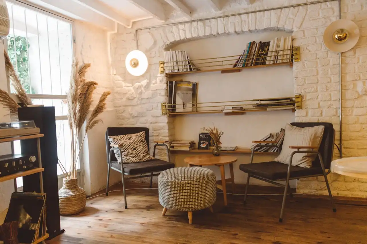
1. Pushing All Your Furniture Against the Walls
You might think that shoving every piece of furniture against the walls creates more space, but this approach actually makes your room feel disconnected and awkward.
When you line up your sofa, chairs, and tables around the perimeter, you create a bowling alley effect that kills conversation and intimacy.
This mistake stems from a common misconception that floor space equals room to breathe. Instead, you end up with a giant empty void in the center that feels cold and uninviting.
Your guests will struggle to hear each other across the vast expanse, and the room loses its cozy, welcoming atmosphere.
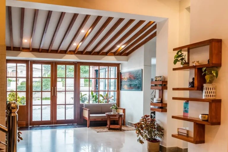
The key lies in creating conversation areas that bring people together. Pull your sofa away from the wall by at least 12 inches, and angle your chairs toward each other.
This arrangement encourages interaction and makes your space feel more intentional and designed.
You can also use area rugs to define these conversation zones. Choose a rug large enough that all furniture legs rest on it, or at least the front legs of larger pieces.
This technique anchors your furniture groupings and creates visual cohesion that ties everything together beautifully.
2. Choosing the Wrong Size Area Rug
You spot a beautiful rug on sale and grab it without measuring your space first.
This impulsive decision often leads to one of the most common decorating mistakes: selecting an area rug that’s too small for your room.
A tiny rug floating in the middle of your living room looks like a postage stamp and makes your entire space feel disjointed.
When you choose a rug that’s too small, you miss the opportunity to anchor your furniture and create visual boundaries.
Your room lacks definition, and individual pieces seem to float without purpose. This mistake is particularly noticeable in open floor plans where rooms flow into each other.
You want your rug to be large enough that all major furniture pieces either sit completely on it or have their front legs resting on the surface.
In a living room, this typically means choosing a rug that’s at least 8×10 feet, though larger spaces may require 9×12 or even bigger options.
For dining rooms, ensure your rug extends at least 24 inches beyond the table on all sides. This extra space allows chairs to remain on the rug even when pulled out for seating.
In bedrooms, you want the rug to extend beyond the sides and foot of your bed, creating a soft landing for your feet each morning.
3. Hanging Artwork Too High
You carefully select the perfect artwork for your wall, then hang it at eye level – your eye level while standing on a stepladder.
This common mistake leaves your beautiful pieces floating near the ceiling, disconnected from your furniture and the people enjoying your space.
Most people hang artwork much higher than necessary, often because they’re trying to avoid furniture or simply don’t know the proper height.
When you hang art too high, it creates an awkward gap between your furniture and wall décor, making the room feel unbalanced and poorly planned.
The golden rule for hanging artwork is positioning the center of the piece 57-60 inches from the floor.
This height works for most people and creates a comfortable viewing experience whether you’re sitting or standing.
If you’re hanging art above furniture, aim for 6-8 inches above the piece to create a visual connection.
For gallery walls or multiple pieces, treat the collection as one large artwork and center the grouping at the 57-inch mark.
You can adjust slightly based on your ceiling height and furniture scale, but this guideline will serve you well in most situations.
Remember to step back and assess the visual balance before finalizing the placement.
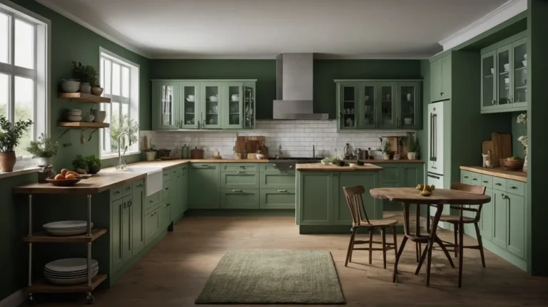
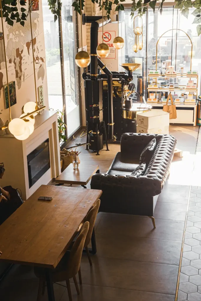
4. Poor Lighting Choices
You flip on your overhead light and call it good, but relying solely on harsh ceiling fixtures creates an unwelcoming atmosphere that flattens your space.
This lighting mistake makes even the most beautifully decorated room feel like a sterile office or hospital waiting room.
Overhead lighting casts unflattering shadows and creates a one-dimensional environment that lacks warmth and depth.
Your carefully chosen colors appear washed out, and the ambiance you’re trying to create gets lost under the glare of fluorescent or stark LED bulbs.
You need to layer your lighting using three types: ambient, task, and accent lighting. Ambient lighting provides general illumination through ceiling fixtures or recessed lights.
Task lighting helps you perform specific activities like reading or cooking, while accent lighting highlights architectural features or artwork.
Start by adding table lamps, floor lamps, and wall sconces throughout your space.
Use warm-toned bulbs (2700K-3000K) to create a cozy atmosphere, and install dimmer switches wherever possible.
You’ll be amazed at how proper lighting transforms your room from basic to beautiful, creating depth and visual interest that overhead lighting simply cannot achieve.
5. Ignoring Scale and Proportion
You fall in love with a petite accent chair that looks adorable in the showroom, but when you get it home, it disappears next to your oversized sectional sofa.
This scale mismatch creates visual confusion and makes your room feel unbalanced and poorly planned.
Scale refers to the size of objects in relation to the space, while proportion deals with how objects relate to each other.
When you ignore these principles, you end up with rooms that feel off-kilter, even if you can’t immediately identify why something seems wrong.
Common scale mistakes include tiny artwork on large walls, massive furniture in small rooms, or mixing pieces that don’t complement each other size-wise.
Your coffee table should be roughly two-thirds the length of your sofa, and side tables should be within two inches of your sofa arm height.
To fix proportion issues, create visual weight balance throughout your room. If you have one large piece of furniture, balance it with appropriately sized accessories or artwork.
Group smaller items together to create more visual impact, and don’t be afraid to go bigger with key pieces like rugs, artwork, or lighting fixtures.
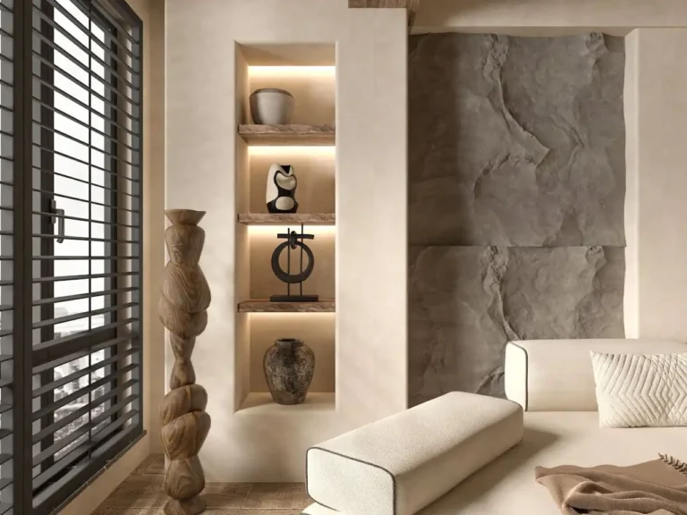
6. Cluttering Surfaces with Too Many Accessories
You love collecting decorative objects, and you want to display every beautiful piece you own.
Your coffee table, side tables, and shelves become showcases for dozens of small items, creating visual chaos that overwhelms your space and makes cleaning a nightmare.
When you over-accessorize, you lose the impact of individual pieces because everything competes for attention.
Your eye doesn’t know where to focus, and the overall effect feels cluttered and stressful rather than curated and intentional. Each beautiful object gets lost in the crowd.
The solution lies in embracing the power of editing and negative space. Choose your favorite pieces and store the rest, rotating your display seasonally to keep things fresh.
Follow the rule of three when grouping accessories – odd numbers create more visual interest than even arrangements.
You want to leave breathing room between objects and create intentional empty spaces that allow the eye to rest.
Group items by height, color, or material to create cohesion, and don’t feel compelled to fill every available surface.
Sometimes the most powerful decorating statement is knowing when to stop adding elements.
7. Following Trends Instead of Personal Style
You scroll through Pinterest and Instagram, then rush out to buy every trendy piece you see, regardless of whether it fits your lifestyle or existing décor.
Your home becomes a collection of disconnected trend pieces that lack cohesion and personal meaning.
Chasing every design trend leads to a space that feels generic and constantly outdated.
You end up spending money on pieces you’ll tire of quickly, and your home never develops a distinctive personality that reflects who you are and how you live.
While it’s fine to incorporate current trends through easily changeable elements like throw pillows or artwork, your major furniture pieces should reflect your personal style and practical needs.
Consider your lifestyle, color preferences, and the architectural style of your home when making decorating decisions.
Focus on creating a cohesive color palette and stick to furniture styles that complement each other.
You can add trendy touches through accessories, but your foundation pieces should be timeless choices that you’ll love for years to come.
Remember that the best-decorated homes reflect their owners’ personalities, not the latest magazine spread.
Conclusion
Transform your space by avoiding these common pitfalls and implementing thoughtful design principles.
Your home should reflect your personality while functioning beautifully for your daily life.