27 Breathtaking Dining Room Paint Colors to Transform Your Mealtime Experience
Thinking about refreshing your dining space?
The right paint color can completely transform the atmosphere where you gather for meals and make memories.
From bold statement hues to subtle neutrals that stand the test of time, your dining room color choice sets the stage for countless dinner parties and family gatherings.
Your dining room deserves special attention since it’s where you entertain guests and share important moments.
The perfect color can enhance your existing furniture while creating the exact mood you’re aiming for—whether that’s energetic and lively or calm and sophisticated.
Let’s explore 27 stunning dining room paint colors that designers and homeowners love, along with tips on how to incorporate them into your space.
1: Classic Navy Blue

Navy blue creates an elegant, timeless backdrop for your dining space. This sophisticated hue pairs beautifully with gold or brass accents and white trim.
The depth of navy allows your dishware and table settings to stand out dramatically.
It works equally well in traditional and modern spaces, making it a versatile choice that won’t quickly go out of style.
2: Sage Green

This calming, nature-inspired color brings the outdoors in and creates a serene dining environment.
Sage green has enough gray undertones to keep it sophisticated rather than overly rustic.
It complements both light woods and darker furniture finishes. For a cohesive look, pair sage walls with botanical prints or fresh greenery as table centerpieces.
3: Warm Terracotta

Terracotta creates an instantly warm, welcoming atmosphere that encourages lingering conversations at the dinner table.
This earthy tone is making a major comeback in interior design.
The rich, reddish-brown hue pairs beautifully with natural materials like wood, rattan, and linen.
Consider using terracotta as an accent wall if you’re hesitant to commit to the full room.
4: Soft Greige

Greige—that perfect blend of gray and beige—delivers sophisticated neutrality with warmth. This chameleon color shifts subtly throughout the day as lighting changes.
It provides an excellent backdrop for colorful artwork and table settings.
Greige also works well with nearly any design style from farmhouse to contemporary.
5: Dramatic Charcoal

Make a bold statement with deep charcoal walls that create an intimate, cocoon-like dining experience. This dramatic choice feels luxurious and unexpected in dining spaces.
Charcoal walls look stunning against light-colored furniture and bright white trim.
Add metallic accents to reflect light and prevent the space from feeling too dark.
6: Blush Pink

Soft blush creates a flattering, romantic glow that makes everyone and everything look better.
This subtle pink has enough gray undertones to keep it sophisticated rather than juvenile.
It pairs beautifully with gold, brass, and natural wood tones. Blush dining rooms feel especially magical in evening light, making dinner parties feel extra special.
7: Crisp White

Never underestimate the power of a perfectly chosen white paint. This timeless choice creates a clean canvas that lets your furniture and décor take center stage.
Whites with slightly warm undertones create a more inviting atmosphere than stark, cool whites.
Add texture through curtains, rugs, and table linens to prevent the space from feeling clinical.
8: Hunter Green

This deep, forest-inspired green creates a cozy yet sophisticated dining environment.
Hunter green has made a significant comeback in interior design for its timeless yet current appeal.
It pairs beautifully with brass fixtures, walnut furniture, and crisp white trim. The color feels equally at home in traditional spaces and more contemporary settings.
9: Warm Taupe

Taupe provides subtle warmth while remaining firmly in the neutral family. This versatile color shifts beautifully throughout the day as natural light changes.
It pairs well with virtually any wood tone and accent color.
Taupe creates a refined backdrop that lets your table settings and dining furniture become the focal points.
10: Sunny Yellow

Inject joy and energy into your dining space with a cheerful yellow.
This vibrant choice creates a space that feels perpetually sunny, even on gloomy days.
Choose a slightly muted yellow rather than a primary tone for sophistication. Yellow dining rooms encourage conversation and create memorable gathering spaces.
11: Smoky Blue-Gray

This sophisticated hybrid color brings calming properties without feeling too cold.
Blue-grays work beautifully in dining spaces that receive good natural light.
The color shifts subtly throughout the day, sometimes appearing more blue, sometimes more gray. It pairs wonderfully with white woodwork and natural wood tones.
12: Rich Burgundy

Create a dramatic, wine-inspired dining room with deep burgundy walls. This color choice feels particularly appropriate for a space dedicated to food and drink.
The rich red undertones create a sense of warmth and luxury.
Burgundy pairs beautifully with gold accents and dark wood furniture for a traditional, stately feel.
13: Gentle Lavender

Soft lavender creates an unexpected yet soothing dining atmosphere.
This subtle purple has enough gray undertones to keep it sophisticated rather than juvenile.
It pairs beautifully with silver accents and cool-toned woods. Lavender dining rooms feel especially magical in evening light with candles or dimmed lighting.
14: Slate Blue

This deep yet muted blue offers sophistication with a hint of unexpected color.
Slate blue works wonderfully in dining spaces that lack abundant natural light.
It creates a cozy, intimate feeling without the heaviness of darker neutrals. The color pairs beautifully with light woods and brass or gold accents.
15: Warm Mushroom

This earthy neutral brings organic warmth to dining spaces while remaining firmly sophisticated.
Mushroom tones have complex undertones that shift beautifully in different lighting.
They complement both contemporary and traditional furniture styles. This color creates a grounding effect that encourages lingering conversations at the table.
16: Crisp Mint

Bring refreshing energy to your dining space with a crisp, clean mint green.
This color choice feels unexpected and memorable without being overwhelming.
Mint works particularly well in dining spaces with good natural light. It pairs beautifully with white woodwork and natural wood tones for a balanced look.
17: Dusty Coral

This sophisticated pinkish-orange creates a flattering glow that enhances skin tones and food presentation. Dusty coral feels both current and timeless.
It pairs beautifully with brass accents and darker wood tones.
The color brings warmth and energy to dining spaces without feeling overly bold or trendy.
18: Soft Pewter

This silvery neutral adds subtle sophistication to dining spaces. Pewter has cool undertones that create a serene, refined atmosphere.
It shifts beautifully throughout the day as lighting changes.
Pewter pairs wonderfully with both light and dark wood tones and allows colorful table settings to pop.
19: Earthy Olive

This sophisticated green-brown creates a nature-inspired backdrop for dining. Olive has made a significant comeback in interior design for its timeless yet current appeal.
It pairs beautifully with natural materials like wood, stone, and leather.
The color creates a grounding effect that encourages relaxed, comfortable dining experiences.
20: Soft Black

Make a bold yet timeless statement with soft black walls. This dramatic choice creates an intimate, cocoon-like dining experience that feels luxurious.
Choose blacks with subtle undertones (blue-black, green-black) rather than pure black.
Add contrast through light-colored furniture and artwork to prevent the space from feeling too dark.
21: Powder Blue

This soft, airy blue creates a serene dining atmosphere reminiscent of clear skies. Powder blue feels fresh without the coolness that some blues can bring.
It pairs beautifully with white woodwork and warm wood tones.
The color brings a subtle cheerfulness to dining spaces without feeling overly whimsical.
22: Warm Caramel

Create a rich, inviting dining atmosphere with caramel-toned walls. This warm neutral has enough character to stand on its own while supporting your décor.
It pairs beautifully with both light and dark furniture pieces.
Caramel creates a cozy backdrop that encourages lingering conversations at the dinner table.
23: Muted Turquoise

Bring subtle seaside energy to your dining space with a muted turquoise.
This sophisticated blue-green creates a refreshing atmosphere without overwhelming the senses.
It pairs wonderfully with natural woods and white accents. Muted turquoise dining rooms feel simultaneously energizing and calming—perfect for gathering spaces.
24: Clay Pink

This earthy, muted pink creates a sophisticated warmth unlike typical pastel pinks.
Clay pink feels both current and timeless, with enough complexity to remain interesting.
It shifts beautifully throughout the day as lighting changes. The color pairs wonderfully with natural materials like wood, rattan, and stone.
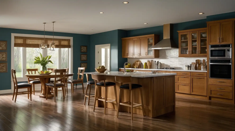
25: Deep Teal

Create a jewel-box effect with rich teal walls that feel both classic and current.
This blue-green hybrid creates depth and interest without overwhelming the space.
Teal pairs beautifully with brass accents and walnut furniture. The color creates an impressive backdrop for dinner parties and special occasions.
26: Warm Cognac

This rich, amber-toned brown creates a cozy, intimate dining atmosphere.
Cognac walls feel particularly appropriate in traditional and transitional spaces.
They pair beautifully with cream accents and a mix of wood tones. This color choice creates a sense of established elegance in dining rooms of any size.
27: Soft Eucalyptus

This muted, gray-green creates a subtle nature-inspired backdrop for dining.
Eucalyptus has enough gray undertones to keep it firmly sophisticated rather than too trendy.
It pairs beautifully with light woods and natural linens. The color creates a fresh yet calming atmosphere that encourages relaxed, enjoyable meals.
Conclusion
Your dining room’s color sets the stage for countless gatherings and memories.
Whether you choose bold and dramatic or soft and subtle, select a hue that resonates with your style and creates the atmosphere you desire for sharing meals.