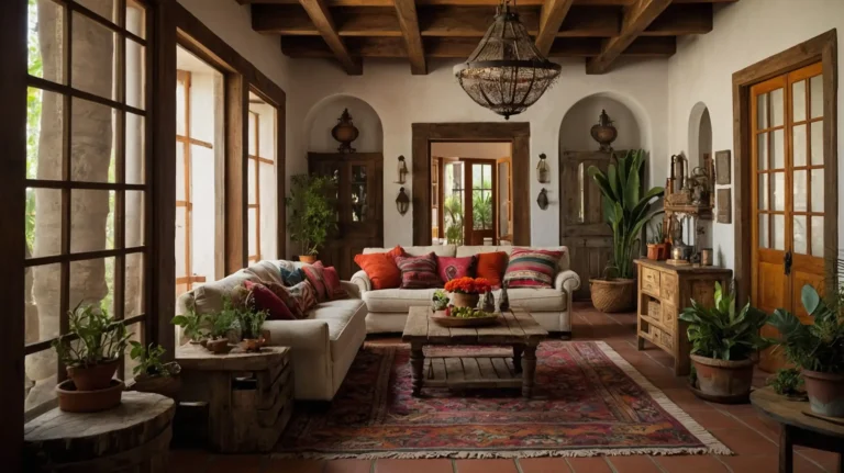
27 Best Paint Colors for Interior Walls: Transform Your Home with These Perfect Shades
Choosing the right paint color can completely transform your living space without breaking the bank.
Whether you’re looking to create a calm sanctuary, an energizing workspace, or a cozy gathering spot, the perfect hue can set exactly the right mood.
With thousands of paint chips to consider, the selection process can feel overwhelming.
That’s why we’ve curated this list of the 27 best interior paint colors that designers and homeowners consistently love.
Ready to refresh your space? Let’s explore these versatile, timeless, and trending shades that will breathe new life into your home.
1: Benjamin Moore’s “Simply White” (OC-117)

This clean, crisp white creates an airy feel in any room. It reflects natural light beautifully, making smaller spaces appear larger and more open.
Simply White works wonderfully as a canvas for colorful art and furniture. It pairs exceptionally well with both warm and cool accent colors.
You’ll find this shade particularly effective in kitchens and bathrooms where cleanliness is visually important.
2: Sherwin-Williams’ “Repose Gray” (SW 7015)

This versatile light gray serves as the perfect neutral backdrop that works with virtually any décor style.
Its subtle warmth prevents it from feeling cold or sterile like some grays can.
Repose Gray changes beautifully throughout the day as the light shifts. It creates a sophisticated foundation for both modern and traditional spaces.
Many designers consider this their go-to gray for its remarkable adaptability and timeless appeal.
3: Behr’s “Blueprint” (S470-5)

This soft, denim-like blue strikes the perfect balance between calming and invigorating. It adds character without overwhelming your space.
Blueprint pairs beautifully with warm woods, crisp whites, and metallic accents. It works exceptionally well in bedrooms, home offices, and living rooms.
This shade has grown increasingly popular for its ability to add subtle color while maintaining a sophisticated, mature feel.
4: Farrow & Ball’s “Hague Blue” (No.30)

This deep, dramatic navy creates instant sophistication in dining rooms, libraries, and powder rooms. Its rich undertones change fascinatingly as light conditions shift.
Hague Blue creates a perfect backdrop for artwork and metallic accents. The depth of color adds incredible dimension to any space.
When used on all four walls, it creates a cocooning effect; as an accent wall, it adds striking visual interest.
5: Benjamin Moore’s “Pale Oak” (OC-20)

This soft, warm neutral creates a gentle backdrop that feels both contemporary and timeless. Its subtle beige undertones add warmth without feeling dated.
Pale Oak adapts beautifully to different lighting conditions. It works wonderfully in transitional spaces like hallways and open-concept areas.
Designers love this shade for its ability to complement both cool and warm accent colors.
6: Sherwin-Williams’ “Naval” (SW 6244)

This rich navy blue adds instant drama and sophistication to any room. It creates a perfect backdrop for gold or brass fixtures and natural wood tones.
Naval works beautifully in dining rooms, powder rooms, and bedrooms. Its depth creates a cocooning effect that feels both luxurious and calming.
This versatile blue pairs well with crisp whites, soft grays, and vibrant accent colors alike.
7: Benjamin Moore’s “Revere Pewter” (HC-172)

This perfect greige (gray-beige hybrid) adapts to almost any lighting situation. It creates a warm, inviting atmosphere without feeling too heavy or dated.
Revere Pewter works beautifully in living spaces, hallways, and bedrooms. It pairs well with both traditional and contemporary furnishings.
This versatile neutral serves as an excellent backdrop for artwork and colorful accessories.
8: Clare’s “Wing It”

This soft, dusty pink creates a subtle warmth without feeling overly feminine or childish. It adds a touch of personality while still functioning as a sophisticated neutral.
Wing It pairs beautifully with gray, navy, or emerald green accents. It creates a surprisingly versatile backdrop for a variety of décor styles.
This blush tone works wonderfully in bedrooms, dining rooms, and even home offices.
9: Farrow & Ball’s “Green Smoke” (No.47)

This deep, smoky sage green adds rich character and timeless sophistication. It creates a cozy, enveloping atmosphere in libraries, dining rooms, and bedrooms.
Green Smoke pairs beautifully with brass fixtures, natural woods, and cream accents. It changes dramatically throughout the day, revealing different undertones as light shifts.
This versatile green works in both traditional and contemporary spaces with equal success.
10: Sherwin-Williams’ “Agreeable Gray” (SW 7029)

This warm greige combines the best qualities of beige and gray. It creates a versatile backdrop that works with virtually any décor style or color palette.
Agreeable Gray appears warmer in south-facing rooms and cooler in north-facing spaces. It pairs beautifully with white trim and wood tones.
Designers repeatedly choose this shade for its remarkable versatility and crowd-pleasing qualities.
11: Benjamin Moore’s “Caliente” (AF-290)

This vibrant, energetic red creates instant warmth and drama. It makes a perfect accent wall in dining rooms, entryways, or living spaces where you want to create a focal point.
Caliente pairs beautifully with neutral backgrounds and natural textures. Its slightly orange undertone keeps it from feeling too heavy or formal.
This bold shade works surprisingly well in small doses, adding energy without overwhelming your space.
12: Behr’s “Nurturing” (S390-3)

This soft, sage green creates a soothing atmosphere that works beautifully in bedrooms and bathrooms. Its subtle gray undertones keep it sophisticated and versatile.
Nurturing pairs wonderfully with warm neutrals, natural woods, and stone surfaces. It adds a touch of nature without committing to a bold statement.
This gentle green creates a perfect backdrop for both modern and traditional furnishings.
13: Sherwin-Williams’ “Alabaster” (SW 7008)

This warm white offers more softness than stark whites without veering into cream territory. It creates a clean, fresh backdrop that enhances any décor style.
Alabaster reflects light beautifully, brightening spaces without feeling sterile. It pairs wonderfully with both cool and warm accent colors.
This versatile white works in any room of your home, creating continuity throughout connected spaces.
14: Farrow & Ball’s “Setting Plaster” (No.231)

This subtle, dusty pink creates unexpected warmth and sophistication. Its depth and complexity give it a timeless quality that transcends trends.
Setting Plaster changes dramatically throughout the day, sometimes appearing more peachy, sometimes more neutral. It pairs beautifully with gray, navy, or olive green accents.
This versatile hue works surprisingly well in living rooms, dining spaces, and bedrooms alike.
15: Benjamin Moore’s “Hale Navy” (HC-154)

This rich, classic navy adds instant sophistication to any space. It creates dramatic impact in dining rooms, powder rooms, and offices without feeling overwhelming.
Hale Navy pairs beautifully with brass fixtures, light woods, and crisp whites. Its deep, velvety finish creates a perfect backdrop for artwork and decorative elements.
This versatile navy works equally well on all four walls or as a striking accent.
16: Clare’s “Headspace”

This soft, airy blue creates an instant feeling of calm and tranquility. It adds subtle color while maintaining a clean, fresh atmosphere in bedrooms and bathrooms.
Headspace changes beautifully throughout the day as natural light shifts. It pairs wonderfully with white, gray, and natural wood tones.
This versatile blue works in both traditional and contemporary settings, adding character without overwhelming your space.
17: Behr’s “Black Evergreen” (PPU12-01)

This deep, moody green-black creates dramatic sophistication in dining rooms, libraries, and accent walls. It adds depth and character without the starkness of pure black.
Black Evergreen pairs beautifully with light neutrals, metallics, and natural textures. It creates a perfect backdrop for highlighting artwork and architectural details.
This versatile dark shade works surprisingly well in spaces where you want to create intimacy and visual interest.
18: Sherwin-Williams’ “Tricorn Black” (SW 6258)

This true, neutral black creates dramatic impact in modern spaces. It works beautifully for accent walls, built-ins, and architectural details you want to highlight.
Tricorn Black pairs perfectly with crisp whites, warm neutrals, and virtually any accent color. It creates a perfect backdrop for highlighting artwork and metallic finishes.
This versatile black works in small doses throughout your home to add depth and architectural interest.
19: Benjamin Moore’s “Pale Verde” (2029-40)

This soft, mint green adds subtle freshness without feeling too juvenile or trendy. It creates a soothing backdrop in bedrooms, bathrooms, and sunrooms.
Pale Verde pairs beautifully with crisp whites, soft grays, and natural wood tones. It adds just enough color to feel special while maintaining versatility.
This gentle green works surprisingly well as an alternative to neutrals in spaces where you want a hint of color.
20: Farrow & Ball’s “India Yellow” (No.66)

This rich, mustard yellow adds instant warmth and energy to any space. It creates a perfect accent wall in living rooms, dining areas, and kitchens.
India Yellow pairs beautifully with navy, charcoal, or deep green accents. Its depth and complexity keep it from feeling too bright or overwhelming.
This versatile yellow changes dramatically throughout the day, revealing different undertones as natural light shifts.
21: Sherwin-Williams’ “Urbane Bronze” (SW 7048)

This deep, earthy bronze creates sophisticated drama in dining rooms, home offices, and accent walls. Its warm undertones keep it from feeling too dark or cold.
Urbane Bronze pairs beautifully with cream, taupe, and natural textures. It creates a perfect backdrop for highlighting architectural details and artwork.
This versatile dark neutral works wonderfully in spaces where you want to create intimacy and visual interest.
22: Benjamin Moore’s “Aegean Teal” (2136-40)

This balanced blue-green creates a perfect blend of calming blue and refreshing green. It adds character and depth without overwhelming your space.
Aegean Teal pairs beautifully with warm neutrals, natural woods, and brass accents. It works wonderfully in kitchens, bathrooms, and living spaces.
This versatile teal changes beautifully throughout the day, revealing different undertones as light shifts.
23: Clare’s “Good Jeans”

This perfect medium denim blue adds instant character and depth. It creates a surprisingly versatile backdrop that works with many décor styles.
Good Jeans pairs beautifully with white, gray, and warm wood tones. It adds personality without overwhelming your space.
This versatile blue works wonderfully in bedrooms, home offices, and living rooms where you want subtle color and sophistication.
24: Sherwin-Williams’ “Accessible Beige” (SW 7036)

This perfect warm neutral bridges the gap between beige and greige. It creates a versatile backdrop that works with virtually any décor style.
Accessible Beige pairs beautifully with white trim, natural woods, and virtually any accent color. It adapts wonderfully to different lighting conditions.
This versatile neutral works throughout your home, creating continuity in open-concept spaces and connected rooms.
25: Benjamin Moore’s “Salamander” (2050-10)

This deep, velvety green creates dramatic sophistication in dining rooms, libraries, and feature walls. It adds instant character without feeling overwhelming.
Salamander pairs beautifully with brass accents, light neutrals, and natural textures. It creates a perfect backdrop for artwork and decorative elements.
This versatile dark green works wonderfully in spaces where you want to create intimacy and visual interest.
26: Farrow & Ball’s “Sulking Room Pink” (No.295)

This complex, dusty rose creates subtle sophistication that transcends typical pink associations. It adds warmth and character without feeling overly feminine.
Sulking Room Pink pairs beautifully with gray, navy, or olive green accents. It changes dramatically throughout the day, revealing different undertones as light shifts.
This versatile hue works surprisingly well in living spaces, bedrooms, and even dining rooms.
27: Sherwin-Williams’ “Iron Ore” (SW 7069)

This soft charcoal creates dramatic sophistication without the harshness of pure black. It works beautifully for accent walls, built-ins, and exterior trim.
Iron Ore pairs perfectly with crisp whites, warm neutrals, and virtually any accent color. It creates a perfect backdrop for highlighting artwork and architectural details.
This versatile dark neutral adds instant character and depth to any space.
Conclusion
The perfect paint color can transform your home from ordinary to extraordinary. Consider your lighting, existing décor, and the feeling you want to create.
Remember to test samples before committing to ensure you’ll love the results.


