27 Best Paint Colors for Furniture: Transform Your Home with These Designer-Approved Shades
Breathing new life into old furniture doesn’t require professional skills—just the right paint color!
Whether you’re upcycling a thrift store find or refreshing a family heirloom, choosing the perfect shade makes all the difference.
You’ll find options for every style below, from timeless neutrals to bold statement colors.
Each shade offers unique possibilities to enhance your space and express your personality.
Ready to transform your furniture and revitalize your home? Let’s dive into the 27 best paint colors that designers and DIY enthusiasts swear by.
1: Classic White (Benjamin Moore’s “Simply White”)
This versatile, clean white works in any space and with any décor style. You’ll find it brightens rooms instantly while making furniture pieces appear fresh and timeless.
Simply White offers a perfect blank canvas for hardware upgrades or decorative elements to shine.
It’s especially effective for cottage, farmhouse, and Scandinavian-inspired spaces.
The subtle warmth in this white prevents it from appearing stark or clinical, making your furniture feel inviting rather than institutional.
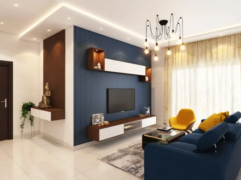
2: Navy Blue (Sherwin-Williams’ “Naval”)
This rich, deep navy adds sophistication to any furniture piece. You’ll create instant drama with this timeless shade that works beautifully as an accent or statement color.
Naval pairs perfectly with brass hardware for a luxurious look. The color’s depth creates visual interest while remaining neutral enough to complement various décor styles.
This shade works exceptionally well on buffets, dressers, and islands where you want to create a focal point in your space.
3: Soft Sage Green (Behr’s “Sage Gray”)

This gentle, earthy green brings nature’s calming influence indoors. You’ll appreciate how this versatile neutral adds subtle color without overwhelming your space.
Sage Gray pairs beautifully with natural wood tones and wicker accents. It’s perfect for creating a serene, organic aesthetic in any room.
This shade looks particularly stunning on kitchen cabinets, bathroom vanities, and bedroom furniture where its soothing qualities can be fully appreciated.
4: Charcoal Gray (Benjamin Moore’s “Wrought Iron”)
This deep, sophisticated gray creates dramatic contrast in light spaces. You’ll love how this nearly-black shade adds modern edge while remaining timeless.
Wrought Iron works beautifully on statement pieces like console tables or coffee tables. Its depth provides the perfect backdrop for metallic hardware to shine.
This versatile color complements both warm and cool color schemes, making it easy to incorporate into your existing décor.
5: Blush Pink (Sherwin-Williams’ “Romance”)
This soft, sophisticated pink adds gentle warmth without feeling childish. You’ll find this understated hue brings subtle color while functioning essentially as a neutral.
Romance works beautifully on smaller accent pieces like side tables, nightstands, or vanities. It pairs particularly well with gold hardware for an elegant, feminine touch.
This versatile shade complements both modern and traditional spaces, adding unexpected dimension to your décor.
6: Mustard Yellow (Farrow & Ball’s “India Yellow”)

This rich, golden yellow infuses furniture with warmth and vintage charm. You’ll find this vibrant yet sophisticated shade instantly brightens any space.
India Yellow creates a perfect focal point when used on accent pieces. It pairs beautifully with dark woods and brass hardware for a midcentury modern aesthetic.
This bold choice works particularly well in neutral rooms where you want to add personality without overwhelming the space.
7: Emerald Green (Benjamin Moore’s “Essex Green”)
This jewel-toned green adds luxurious depth and drama to furniture. You’ll create instant sophistication with this rich shade that feels both timeless and trendy.
Essex Green pairs beautifully with gold or brass hardware for a high-end look. It works especially well on larger pieces like credenzas, bookcases, or islands.
This striking color creates a perfect statement piece while complementing both neutral and colorful décor schemes.
8: Matte Black (Sherwin-Williams’ “Tricorn Black”)
This dramatic, sophisticated black transforms ordinary furniture into statement pieces. You’ll appreciate how this classic shade adds definition and contrast to any space.
Tricorn Black provides the perfect backdrop for decorative hardware to shine. It works particularly well on dining tables, coffee tables, and accent pieces.
This versatile shade complements virtually any décor style, from farmhouse to modern minimalist.
9: Soft Greige (Behr’s “Silver Drop”)
This perfect blend of gray and beige creates a versatile, adaptable neutral. You’ll appreciate how this chameleon-like shade shifts subtly with changing light conditions.
Silver Drop pairs beautifully with both warm and cool tones in your space. It offers more character than plain white while remaining understated and sophisticated.
This adaptable color works especially well on larger furniture pieces like dressers, armoires, and entertainment centers.
10: Dusty Blue (Benjamin Moore’s “Boothbay Gray”)
This muted, grayish blue creates subtle interest without overwhelming your space. You’ll find this sophisticated shade adds depth while functioning essentially as a neutral.
Boothbay Gray pairs beautifully with natural wood tones and wicker accents. Its versatility makes it appropriate for both traditional and contemporary settings.
This adaptable shade works particularly well on kitchen islands, buffets, and bathroom vanities.
11: Terracotta (Sherwin-Williams’ “Cavern Clay”)
This warm, earthy orange-brown brings southwestern charm to any piece. You’ll find this trending shade adds instant warmth and character to furniture.
Cavern Clay creates a perfect focal point when used on accent pieces. It pairs beautifully with natural materials like rattan, jute, and unfinished wood.
This distinctive color works particularly well in spaces with neutral backgrounds where it can become a statement piece.
12: Olive Green (Farrow & Ball’s “Calke Green”)
This rich, earthy green adds natural sophistication to furniture. You’ll appreciate how this complex shade brings the outdoors in while remaining timeless.
Calke Green provides depth and character without overwhelming your space. It pairs beautifully with natural wood tones and antique brass hardware.
This versatile color works exceptionally well on kitchen cabinets, islands, and dining tables where its organic quality enhances mealtime ambiance.
13: Powder Blue (Benjamin Moore’s “Blue Veil”)
This soft, ethereal blue creates a light, airy feeling on furniture. You’ll find this gentle shade adds subtle color while maintaining a serene, calm aesthetic.
Blue Veil pairs beautifully with crisp white accents and silver hardware.
It works particularly well in bedrooms, nurseries, and bathrooms where its soothing qualities shine.
This delicate color provides the perfect background for more vibrant accent colors to pop against.
14: Warm Caramel (Sherwin-Williams’ “Carmel”)
This rich, golden brown adds instant warmth and sophistication. You’ll appreciate how this neutral shade creates depth while complementing existing wood tones.
Carmel pairs beautifully with both light and dark wood accents. It provides a perfect backdrop for antique brass or bronze hardware to shine.
This versatile color works exceptionally well on larger pieces like armoires, bookshelves, and credenzas where its depth can be fully appreciated.
15: Slate Blue (Benjamin Moore’s “Van Deusen Blue”)
This deep, moody blue-gray adds rich sophistication to furniture. You’ll create instant drama with this complex shade that changes subtly throughout the day.
Van Deusen Blue pairs beautifully with natural wood tones and brushed nickel hardware. It creates a perfect statement piece in otherwise neutral spaces.
This versatile shade works particularly well on kitchen islands, buffets, and office furniture where its depth creates visual interest.
16: Coral (Behr’s “Coral Reef”)
This vibrant yet sophisticated pink-orange energizes any furniture piece. You’ll find this cheerful shade instantly brightens spaces while adding personality.
Coral Reef creates a perfect focal point on smaller accent pieces like side tables or nightstands. It pairs beautifully with turquoise, navy, or crisp white accessories.
This bold choice works particularly well in neutral rooms where you want to add a pop of unexpected color.
17: Soft Black (Farrow & Ball’s “Railings”)
This soft, blue-black creates sophisticated drama without the harshness of true black. You’ll appreciate how this complex shade adds definition while maintaining subtle depth.
Railings pairs beautifully with both silver and gold hardware. It works particularly well on dining tables, coffee tables, and accent furniture.
This versatile color creates a perfect anchor in rooms with lighter walls and furnishings.
18: French Gray (Sherwin-Williams’ “Agreeable Gray”)
This perfect greige strikes the ideal balance between warm and cool tones. You’ll find this adaptable shade works seamlessly with virtually any color scheme.
Agreeable Gray provides subtle depth while remaining light enough to use on larger pieces. It pairs beautifully with both antique and modern hardware styles.
This versatile neutral works exceptionally well on kitchen cabinets, built-ins, and larger furniture sets where cohesion is key.
19: Hunter Green (Benjamin Moore’s “Salamander”)
This deep, rich green adds traditional elegance to furniture pieces. You’ll create instant sophistication with this timeless shade that feels both classic and current.
Salamander pairs beautifully with brass hardware and natural wood accents. It works particularly well on statement pieces like islands, credenzas, or bookcases.
This distinctive color provides the perfect backdrop for displaying colorful accessories and art.
20: Soft Lilac (Behr’s “In The Moment”)
This gentle, muted purple creates subtle interest without overwhelming. You’ll appreciate how this unexpected neutral adds personality while remaining sophisticated.
In The Moment pairs beautifully with both silver and gold hardware. It works particularly well on smaller accent pieces like side tables, vanities, or nightstands.
This versatile shade complements both warm and cool color schemes, making it surprisingly adaptable.
21: Taupe (Sherwin-Williams’ “Accessible Beige”)
This perfect warm neutral creates subtle depth without committing to a specific color. You’ll find this adaptable shade works seamlessly with virtually any décor style.
Accessible Beige provides the perfect backdrop for both colorful and neutral accessories. It pairs beautifully with both light and dark wood tones.
This versatile color works exceptionally well on larger furniture pieces where you want substance without overwhelming color.
22: Teal (Benjamin Moore’s “Aegean Teal”)
This balanced blue-green creates instant character on furniture. You’ll appreciate how this complex shade adds color while maintaining a sophisticated, timeless quality.
Aegean Teal pairs beautifully with brass hardware for a luxurious look. It works particularly well on kitchen islands, buffets, and bathroom vanities.
This versatile color creates a perfect statement piece while still complementing other colors in your space.
23: Burnt Orange (Farrow & Ball’s “Charlotte’s Locks”)
This rich, spicy orange adds warmth and vintage charm to furniture. You’ll create instant drama with this bold shade that feels both retro and current.
Charlotte’s Locks creates a perfect focal point when used on accent pieces. It pairs beautifully with dark woods and black hardware for a midcentury modern aesthetic.
This distinctive color works particularly well in neutral spaces where it can become a true statement piece.
24: Pewter (Benjamin Moore’s “Revere Pewter”)
This perfect light gray with warm undertones creates subtle sophistication. You’ll appreciate how this chameleon-like shade adapts to your existing color scheme.
Revere Pewter provides more depth than white while remaining light and versatile. It pairs beautifully with virtually any hardware finish or accent color.
This adaptable shade works exceptionally well on larger furniture collections where cohesion is important.
25: Dark Teal (Sherwin-Williams’ “Oceanside”)
This rich, jewel-toned blue-green adds dramatic elegance to furniture. You’ll create instant sophistication with this complex shade that feels both classic and current.
Oceanside pairs beautifully with gold hardware for a luxurious look. It works particularly well on statement pieces like islands, credenzas, or accent tables.
This distinctive color provides the perfect backdrop for both neutral and colorful accessories to shine.
26: Soft Wheat (Benjamin Moore’s “Gray Mist”)
This warm, golden neutral creates subtle warmth without overwhelming. You’ll appreciate how this versatile shade enhances natural light while remaining sophisticated.
Gray Mist pairs beautifully with both light and dark wood tones. It provides the perfect backdrop for both silver and brass hardware to shine.
This adaptable color works exceptionally well on kitchen cabinets, built-ins, and larger furniture pieces where versatility is key.
27: Raspberry (Farrow & Ball’s “Radicchio”)
This rich, sophisticated red-pink adds unexpected depth and character. You’ll create instant drama with this complex shade that feels both bold and refined.
Radicchio creates a perfect focal point when used on accent pieces. It pairs beautifully with both silver and gold hardware for an elegant, sophisticated look.
This distinctive color works particularly well on smaller furniture pieces where you want to make a confident color statement.
Conclusion
Your furniture deserves the perfect color to showcase its beauty and enhance your space.
Choose a shade that speaks to your style and transforms ordinary pieces into extraordinary focal points.