Beginner’s Guide to Mixing Patterns Without Clashing
Pattern mixing feels intimidating when you’re starting out, but it doesn’t have to be. You can create stunning, cohesive spaces by following a few simple rules.
The key lies in understanding balance, scale, and color relationships. Once you master these fundamentals, you’ll mix patterns like a pro.
Understanding Pattern Basics
Before you dive into mixing patterns, you need to understand the different types available. Geometric patterns include stripes, checks, plaids, and polka dots.
These create structure and energy in your space. Organic patterns feature florals, paisleys, and nature-inspired designs that add softness and movement.
Scale plays a crucial role in successful pattern mixing. Large-scale patterns make bold statements and work best as focal points.
Medium-scale patterns bridge the gap between dramatic and subtle elements. Small-scale patterns, like tiny dots or mini checks, act almost like textured solids from a distance.
Understanding pattern families helps you make smart choices. Linear patterns include stripes, checks, and geometric grids. The visual weight of patterns matters just as much as their size.
Curved patterns encompass florals, paisleys, and swirls. Mixing one linear with one curved pattern often creates pleasing contrast without overwhelming your space.
Bold, high-contrast patterns carry more visual weight than subtle, tone-on-tone designs. You’ll want to balance heavy patterns with lighter ones to avoid visual chaos.
The Golden Scale Rule
The scale rule forms the foundation of successful pattern mixing. You should combine patterns of different sizes to create visual harmony.
Start with one large-scale pattern as your anchor piece. This could be a bold floral wallpaper, a large geometric rug, or oversized throw pillows.
Add a medium-scale pattern next. This bridges the gap between your large anchor pattern and smaller details.
Think striped curtains, medium-sized polka dots, or a moderately scaled plaid. The medium pattern should complement your large pattern without competing for attention.
Finish with small-scale patterns that add texture and interest. Tiny checks, mini florals, or small geometric prints work beautifully here.
These patterns often read as textured solids from a distance, giving you flexibility in placement. Remember that you don’t need to use all three scales in every space.
Sometimes combining just large and small patterns creates the perfect balance. Trust your eye and adjust as needed until the combination feels right.
Mastering Color Coordination
Color creates the thread that ties different patterns together. Start by choosing a cohesive color palette before selecting patterns.
You can pull colors from artwork, a favorite rug, or even nature outside your window. Limit yourself to three or four main colors for the most successful results.
Use the 60-30-10 rule as your guide. This creates balance while allowing patterns to work together harmoniously.
Your dominant color should appear in about 60% of the space, your secondary color in 30%, and your accent color in 10%.
Consider the undertones in your chosen colors. Warm undertones include hints of yellow, orange, or red. Cool undertones lean toward blue, green, or purple.
Mixing warm and cool undertones can create muddy, unpleasant combinations. Stick to one temperature family for the most cohesive look.
Don’t forget about white and neutral spaces between patterns. These breathing areas prevent your space from feeling chaotic or overwhelming.
White space allows each pattern to shine individually while contributing to the overall design harmony.
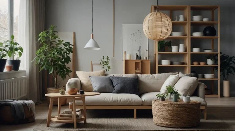
Using Neutrals as Anchors
Neutrals serve as the calm foundation that allows bold patterns to shine. Think of neutrals as the quiet friend who makes everyone else look good.
Beiges, grays, whites, and soft browns create breathing space between more energetic patterns.
Start with neutral furniture pieces when you’re nervous about pattern mixing. A neutral sofa provides a safe backdrop for patterned pillows and throws.
You can experiment with bolder patterns in accessories without committing to major furniture pieces.
Neutral patterns work differently than solid neutrals. Subtle stripe wallpaper, tone-on-tone damasks, or barely-there geometric prints add interest without overwhelming your space.
These patterns bridge the gap between solids and bold prints beautifully.
Consider texture when working with neutrals. A smooth linen pairs beautifully with nubby wool or rough jute.
Varying textures in similar colors creates depth and interest even when patterns are minimal.
Distinguishing Texture from Pattern
Texture and pattern work together but serve different purposes in your design. Patterns create visual interest through repeated designs or motifs.
Textures add tactile interest through the actual surface quality of materials. Understanding this difference helps you layer both elements successfully.
Textured fabrics like bouclé, tweed, or linen weaves add depth without competing with bold patterns.
You can pair a textured solid with a busy print more easily than combining two competing patterns. The texture provides interest while letting the pattern take center stage.
Natural textures bring organic elements into your space. Woven baskets, rough wood surfaces, and stone elements add texture without pattern.
These materials ground busy patterns and prevent your space from feeling too busy or artificial.
Layer different textures in similar colors for sophisticated looks. A linen curtain, wool rug, and silk pillow in varying shades of blue create depth through texture variation.
This approach works especially well in minimalist spaces where pattern takes a backseat to material beauty.
Starting Small with Confidence
Begin your pattern mixing journey with accessories rather than major pieces. Throw pillows offer the perfect testing ground for pattern combinations.
You can mix a striped pillow with a floral one and add a solid neutral for balance. If the combination doesn’t work, you’ve only invested in a few pillows.
Layer patterns gradually rather than attempting complex combinations immediately. Start with two patterns that share common colors.
Once you feel comfortable with this pairing, add a third element. Building slowly helps you develop confidence and understanding.
Use the tried-and-true stripe-and-floral combination as your training wheels. This classic pairing works because stripes provide structure while florals add softness.
Choose versions that share at least one common color for the most foolproof results. Don’t forget about solid colors in your pattern mixing.
Solids provide visual rest and prevent pattern overload. They also highlight your beautiful pattern choices by giving them space to breathe and shine.
Common Mistakes to Avoid
Many beginners make the mistake of using patterns that are too similar in scale. Avoid using too many different color families in one space.
Two medium-sized patterns placed together often compete rather than complement each other. Vary your scales for the most pleasing combinations.
While you might love that purple floral, red plaid, and yellow stripe individually, they probably won’t work together.
Stick to a cohesive color palette for the most professional-looking results. Don’t place competing patterns directly next to each other without breathing room.
A busy floral curtain placed immediately next to a bold geometric wallpaper creates visual chaos. Add neutral elements between strong patterns to give your eyes places to rest.
Resist the urge to match everything perfectly. Pattern mixing should feel collected and layered, not overly coordinated.
Some slight variation in color tones actually makes combinations more interesting and sophisticated.
Room-by-Room Applications
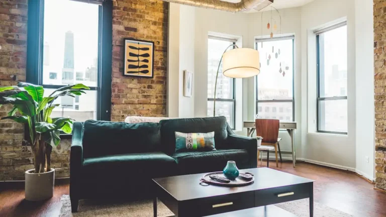
Living rooms offer the most opportunities for pattern mixing. Start with a neutral sofa and add patterned pillows in varying scales.
Layer a patterned rug under neutral furniture, then add pattern through window treatments, artwork, or lampshades. Remember to include solid elements to balance busy areas.
Bedrooms call for more restrained pattern mixing since they should feel relaxing. Try a patterned duvet with solid sheets and one accent pillow in a complementary pattern.
Window treatments offer another opportunity to add pattern without overwhelming the sleep space.
Kitchens work well with smaller-scale patterns that won’t compete with busy countertops and appliances.
Consider patterned backsplashes, window valances, or dining chair cushions. Keep larger surfaces like cabinets and walls in solid colors for the most balanced look.
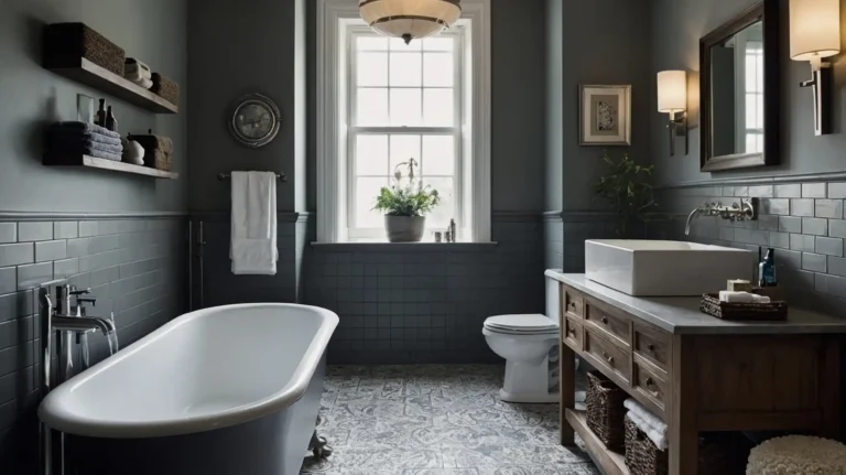
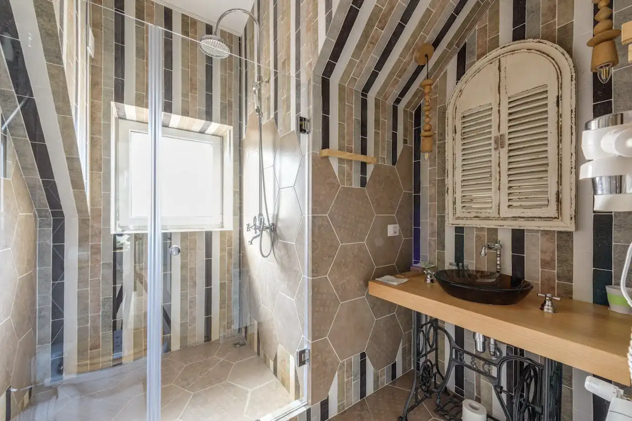
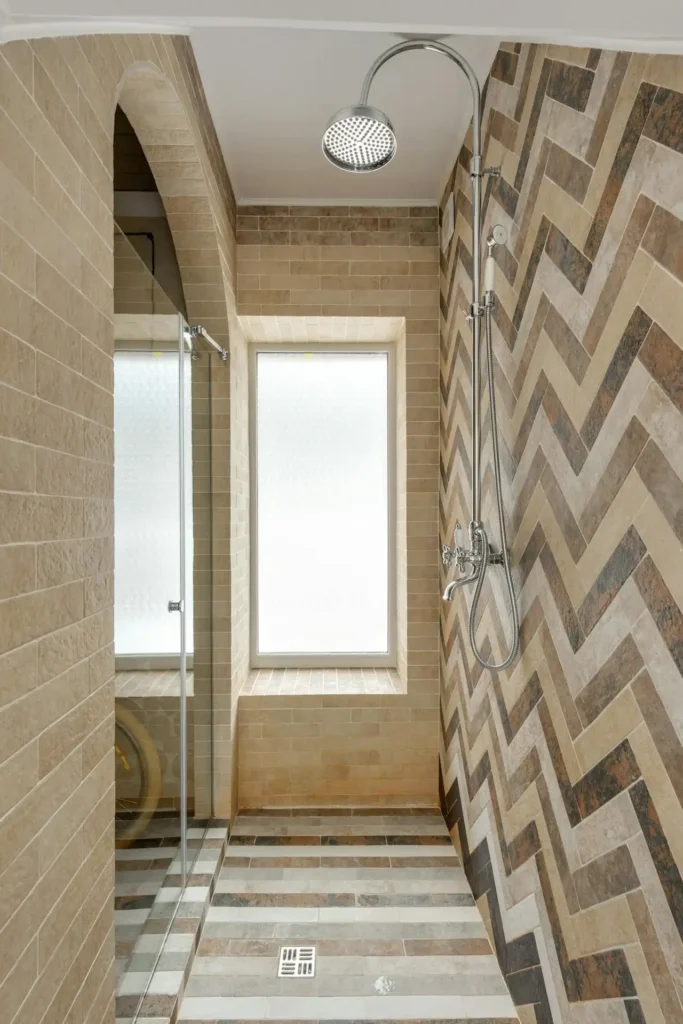
Bathrooms benefit from pattern in small doses. Alternatively, try patterned floor tiles with solid wall colors and neutral fixtures.
A patterned shower curtain paired with solid towels and accessories creates interest without chaos.
Advanced Mixing Techniques
Once you master basic pattern mixing, you can experiment with more complex combinations. Try mixing three patterns by varying both scale and style.
Combine a large floral with medium stripes and small polka dots for a sophisticated layered look.
Consider pattern direction when creating advanced combinations. Horizontal stripes make rooms feel wider, while vertical stripes add height.
Diagonal patterns create energy and movement. Mix different directional patterns thoughtfully to enhance your room’s proportions.
Experiment with tonal pattern mixing using different shades of the same color. This technique works especially well in monochromatic color schemes.
Navy and white stripes with navy and white florals in different scales create depth while maintaining cohesion.
Don’t forget about metallic patterns and accents. Gold or silver geometric patterns can add glamour to textile combinations.
Use metallic sparingly as accent elements rather than dominant patterns for the most elegant results.
Building Confidence Over Time
Pattern mixing becomes easier with practice and observation. Study rooms you admire in magazines or online to understand how designers combine patterns successfully.
Notice the scale relationships, color connections, and breathing space between elements. Start a inspiration file of pattern combinations that appeal to you.
This helps you identify your personal style preferences and color inclinations. You’ll begin to notice patterns in your preferences that guide future decorating decisions.
Trust your instincts as they develop through experience. If a combination feels right to you, it probably is.
Design rules provide helpful guidelines, but your personal taste and comfort matter most in your own space.
Remember that pattern mixing should reflect your personality and lifestyle.
Choose patterns that make you happy and create the mood you want in each space. Confidence in your choices shows in the final result.
Conclusion
Pattern mixing transforms ordinary spaces into dynamic, personalized environments. Start with simple combinations, follow basic guidelines, and trust your developing instincts.
Soon you’ll create beautifully layered spaces that reflect your unique style and personality.